For homes nationwide, both inside and out, gray has been the predominant color for many years. But at long last, its absolute reign may be winding down. “Clients are really concerned about gray,” says Leigh Spicher, national director of design studios at Ashton Woods, a midsized Atlanta-based builder whose homes are located across the South. “In the search for what will feel timeless going forward, people are leaning toward more natural tones.”
Cool grays, which have a blue undertone, are being edged out by warmer grays (which have a brownish undertone), greige, and white. Meanwhile, the dark end of the spectrum—including black, charcoal, dark brown, navy blue, and other similarly deep hues—also feels fresh. We talked to color consultants, product manufacturers, and builders to find out what palettes are winning over homeowners now.
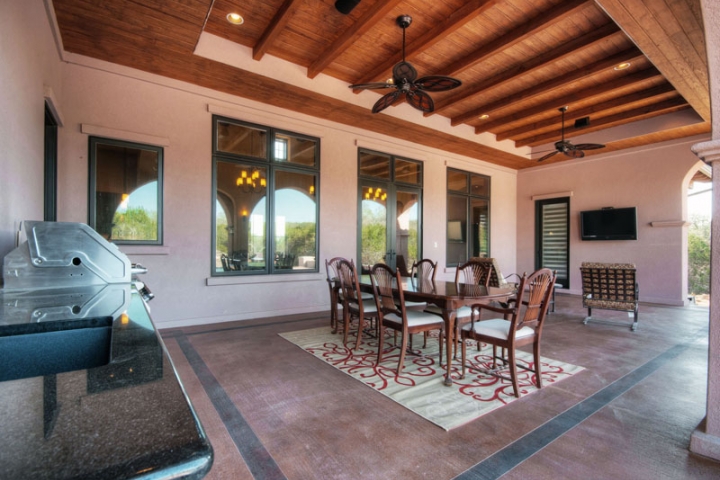
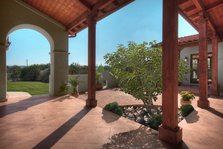
Outside Influences
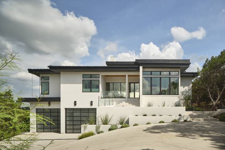
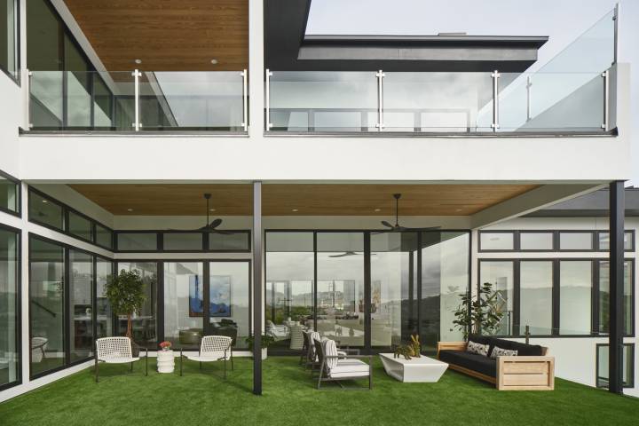
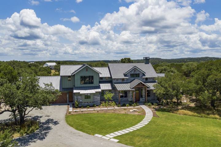
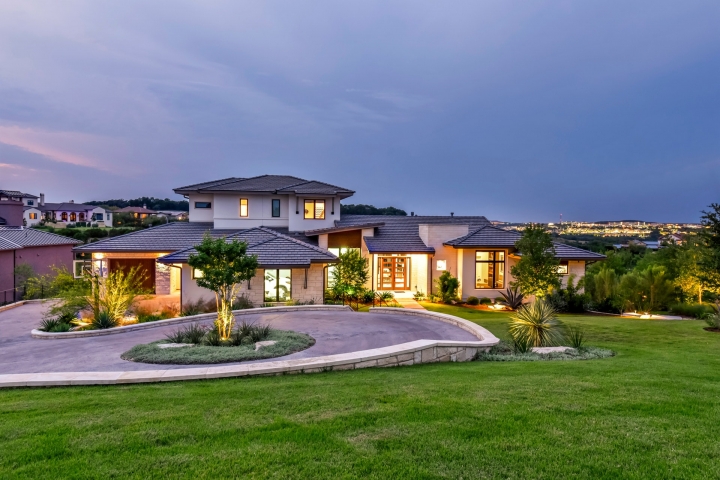
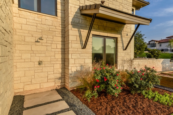
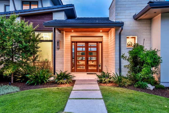
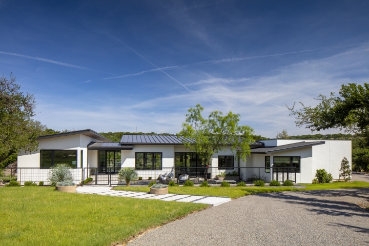
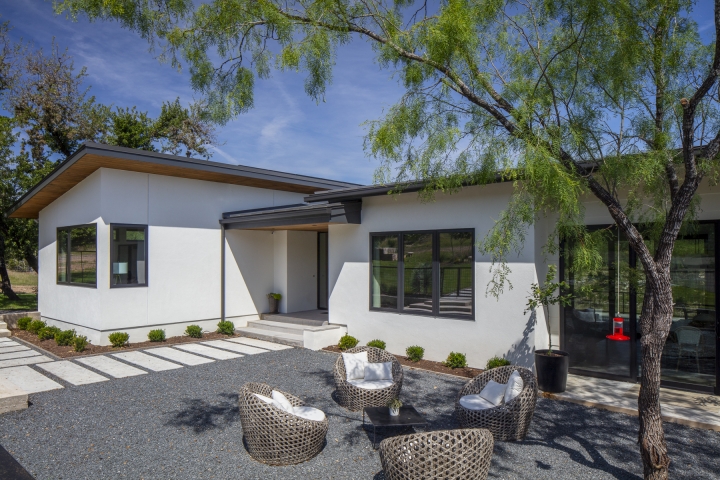
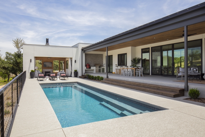
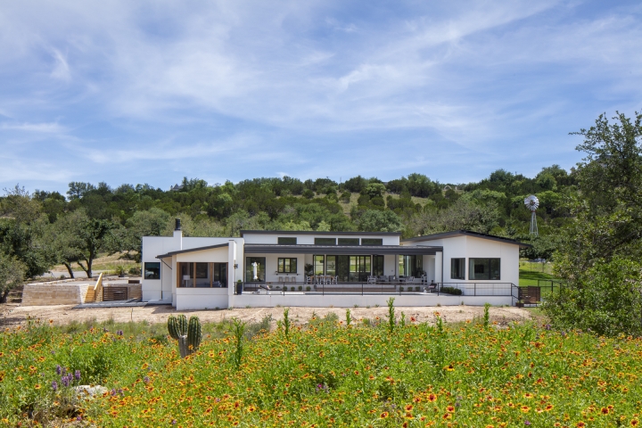
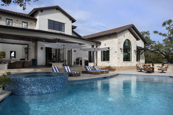
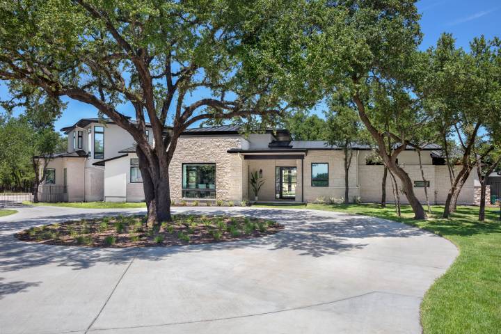
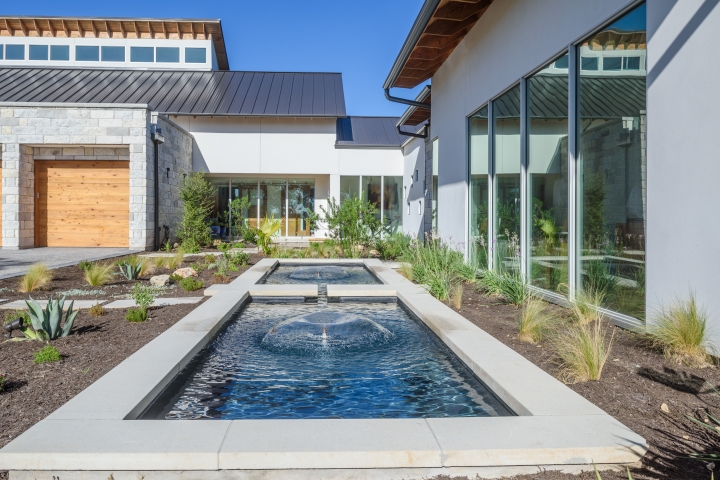
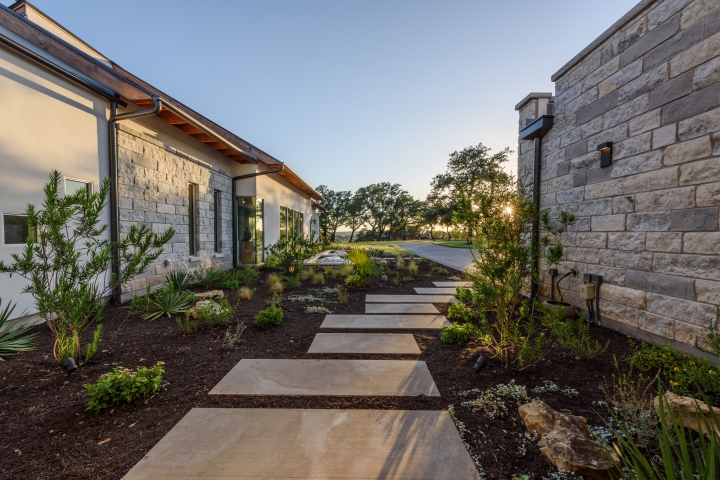
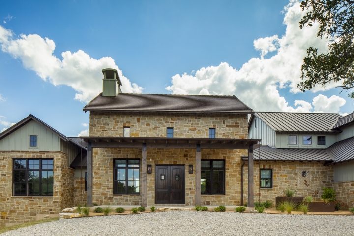
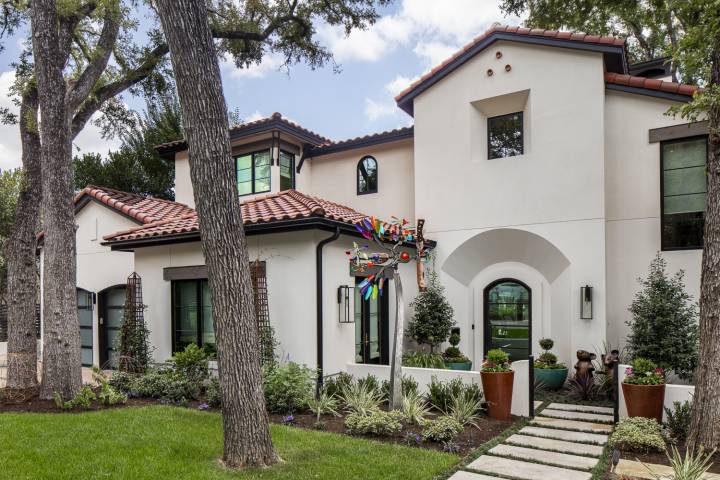
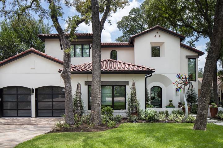
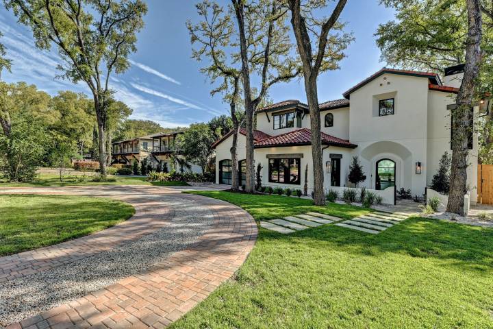
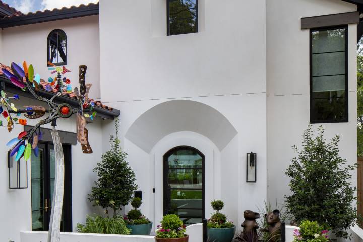
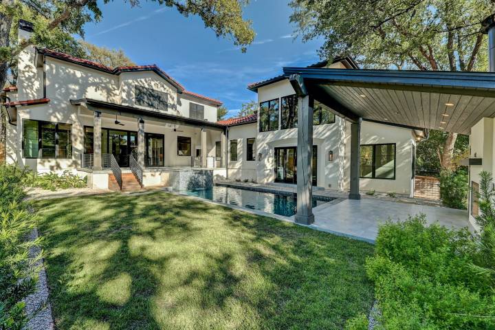
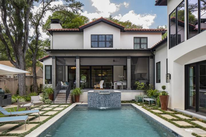
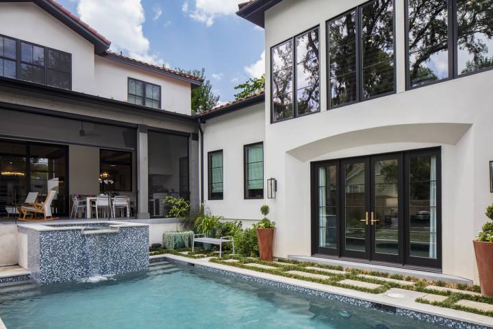
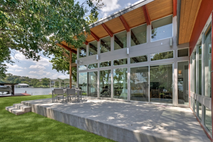
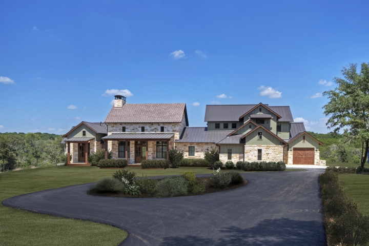
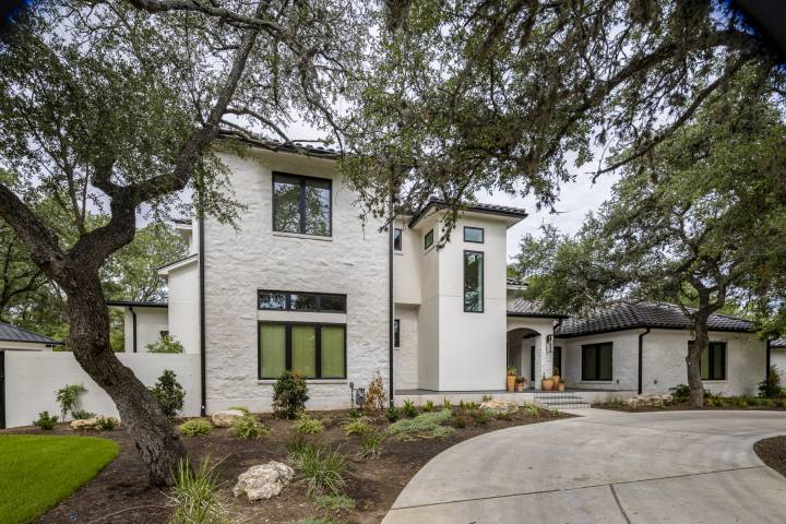
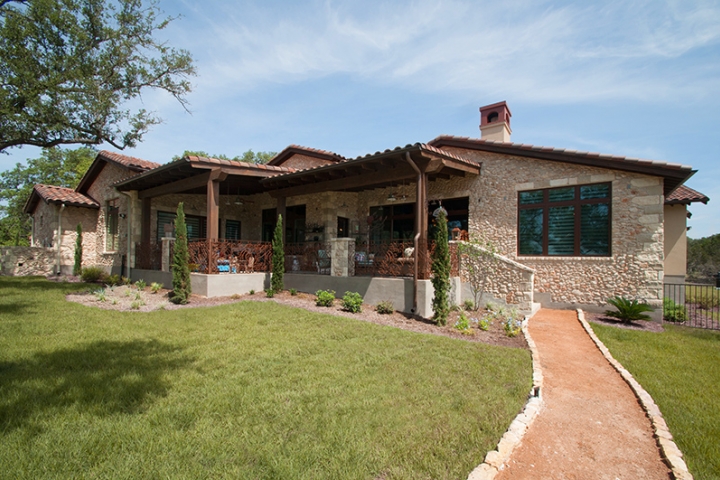
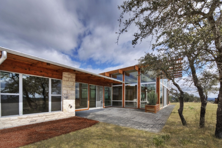
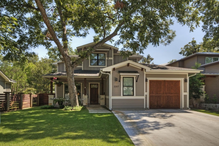
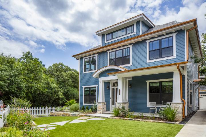
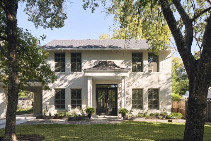
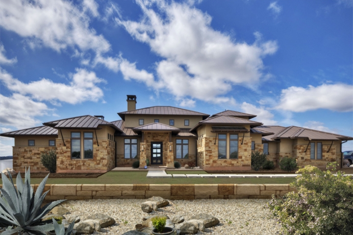
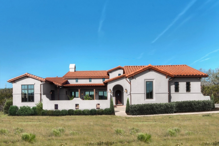
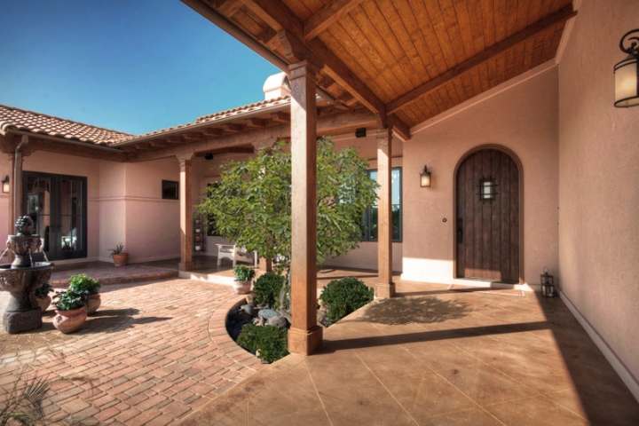
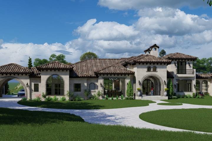
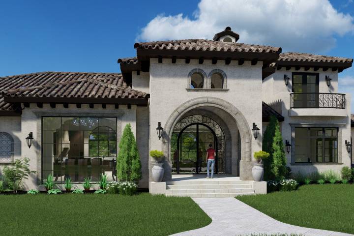
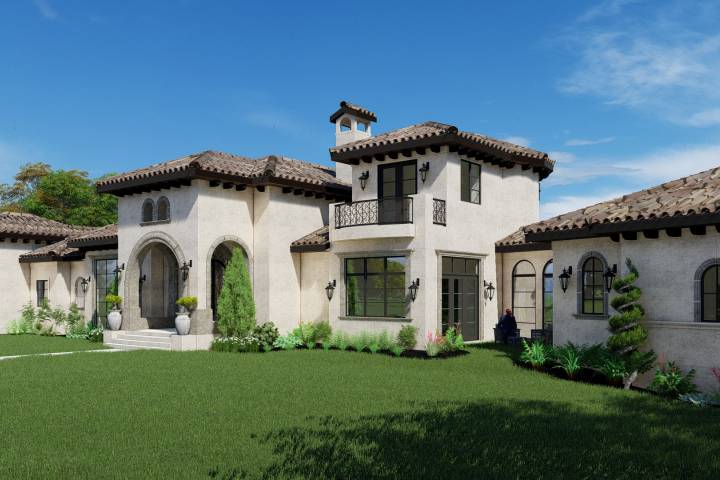
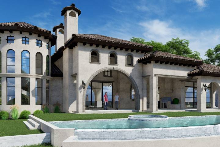
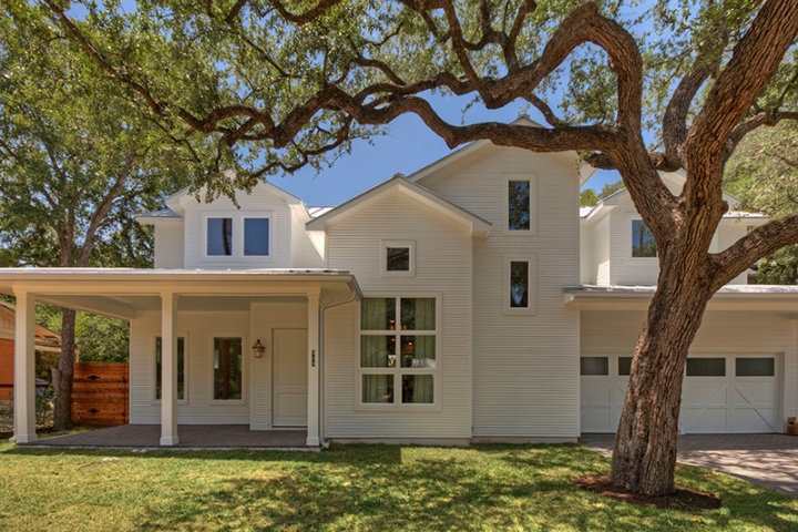
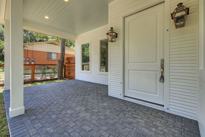
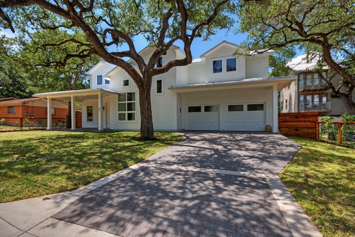
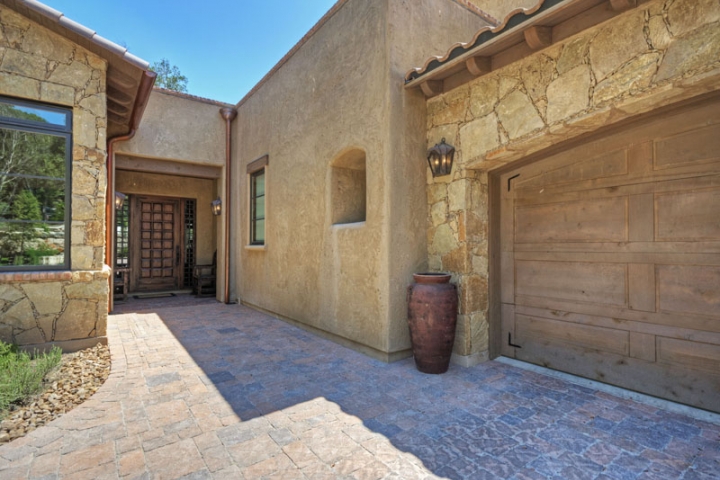
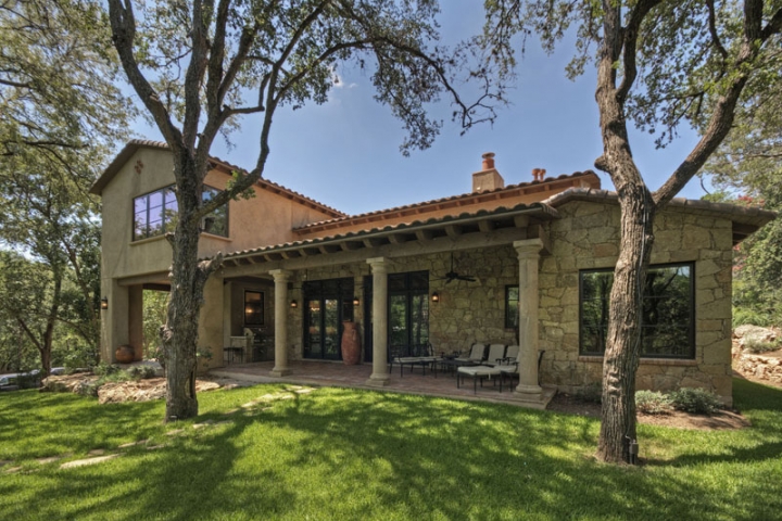
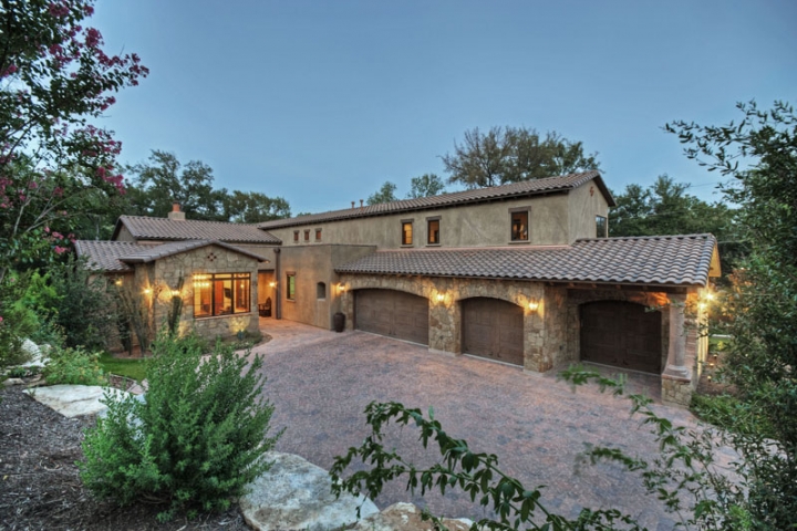
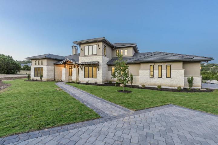
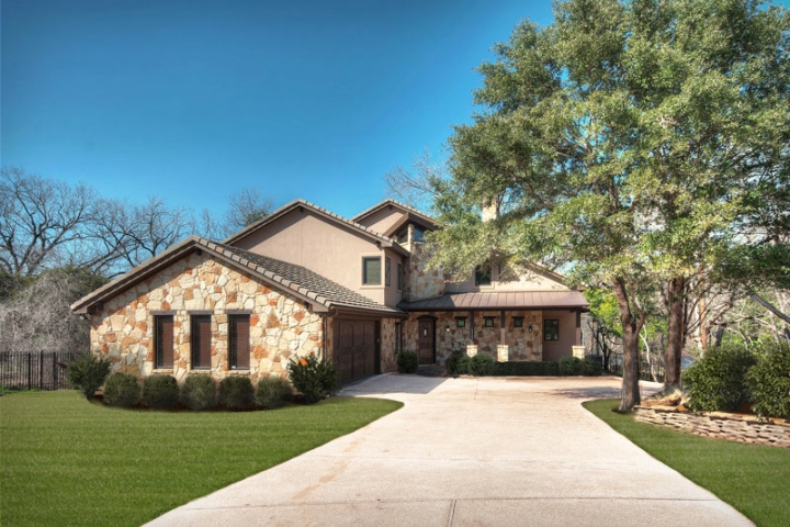
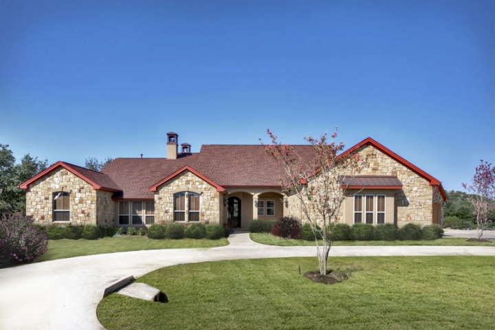
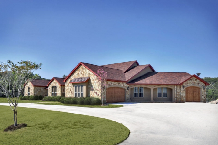
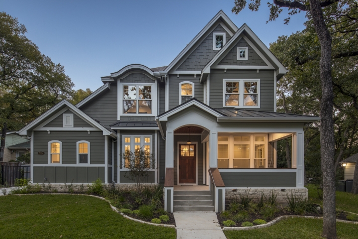
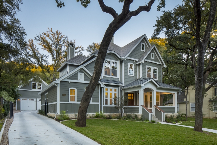
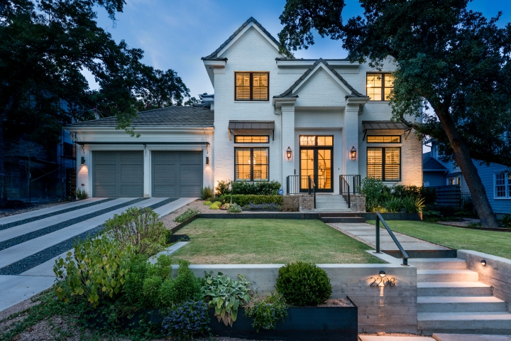
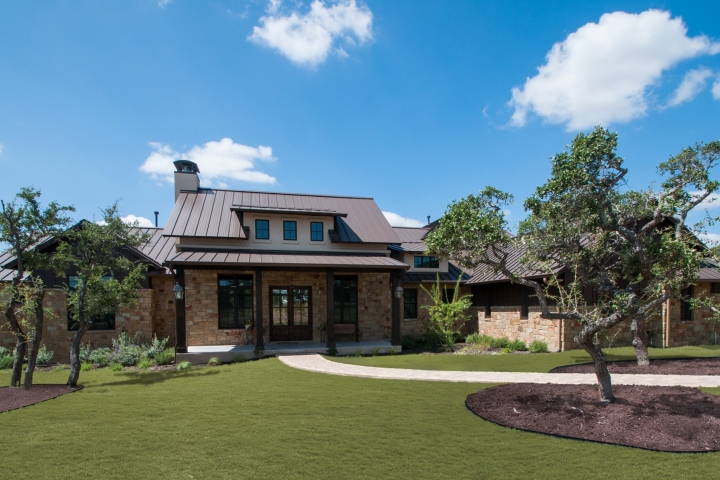
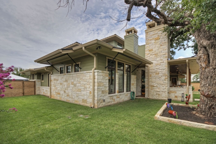
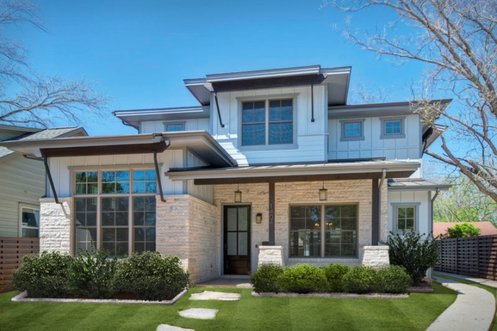
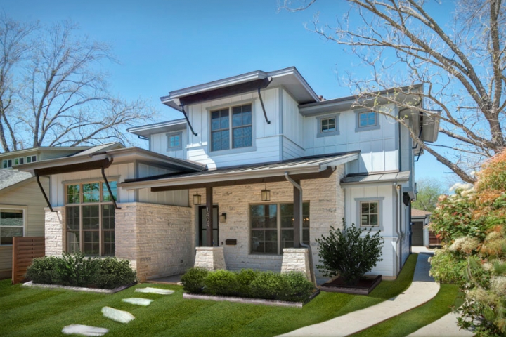
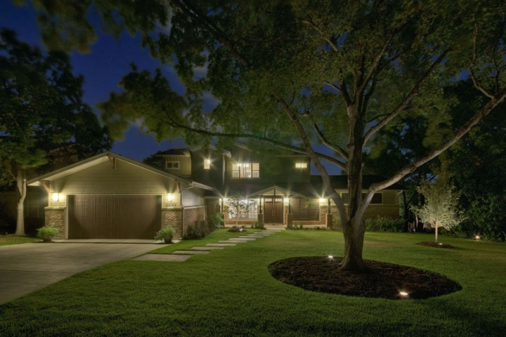
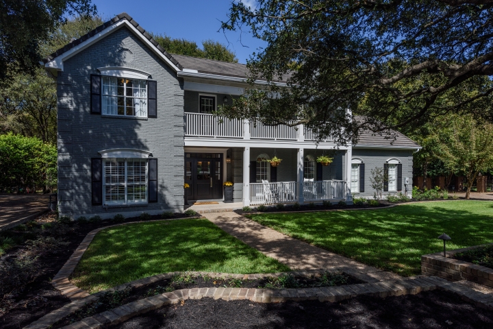
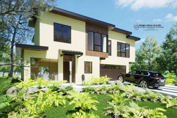
For exteriors, creamy white is a winning choice. And no wonder: The classic neutral is equally at home on contemporary dwellings, Mediterranean villas, and Colonial houses alike. At cement fiber board company Allura, its top selling shade of prefinished siding is a white called Snow; followed by Linen, a light greige.
Within this move toward warmer tones, beige is reappearing—though it may go by another name. “People are calling it ‘sand’ or ‘teddy bear fur’ or ‘camel,’” notes color consultant Mark Woodman, former president of the Color Marketing Group. For gray-heavy developments, he recommends using greige to mix it up. “Greige is a useful transition color. Once you warm up one house, it’s easier to move over to beige,” he notes. According to Gena Kirk, vice president of corporate studio at KB Home, homeowners are selecting more earthy shades in addition to gray.
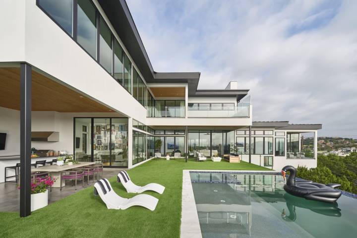
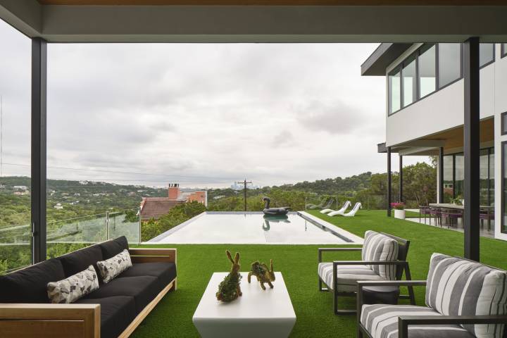
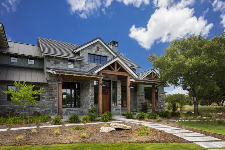
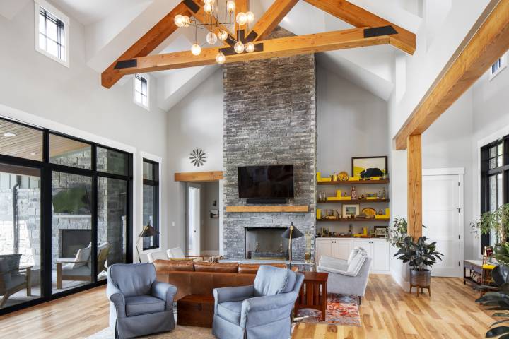
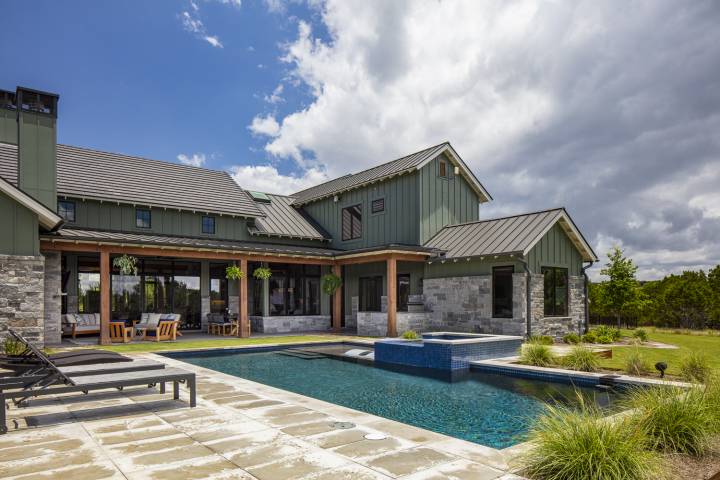
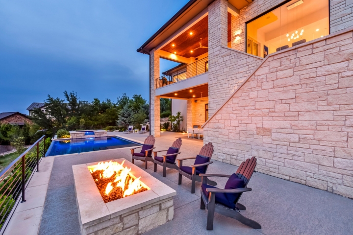
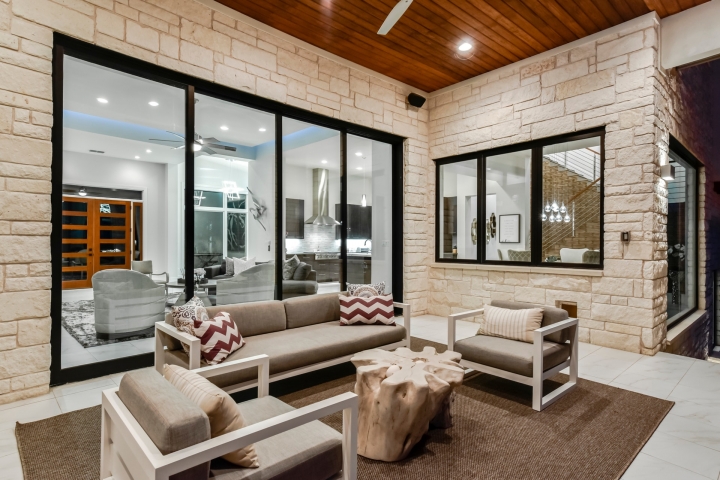
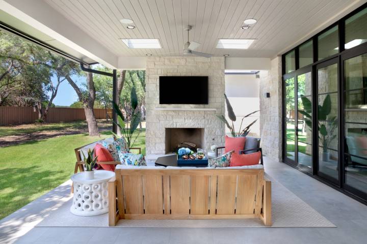
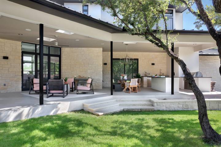
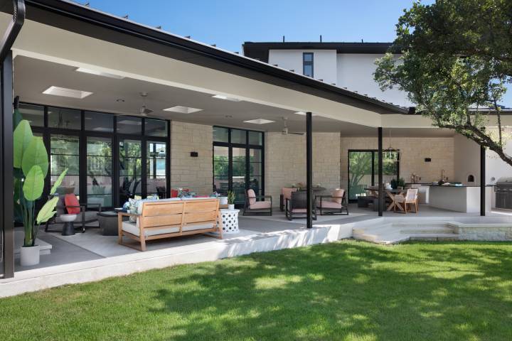
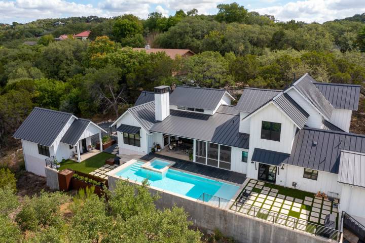
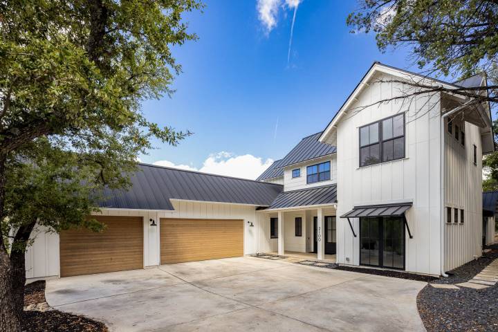
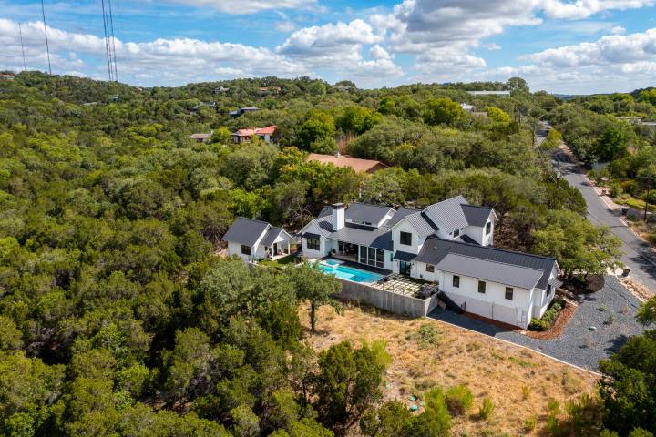
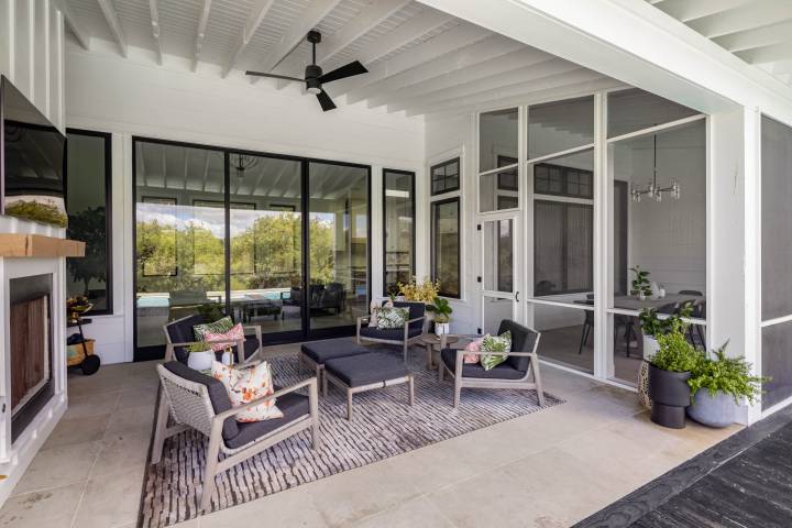
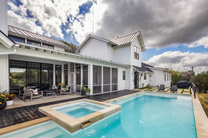
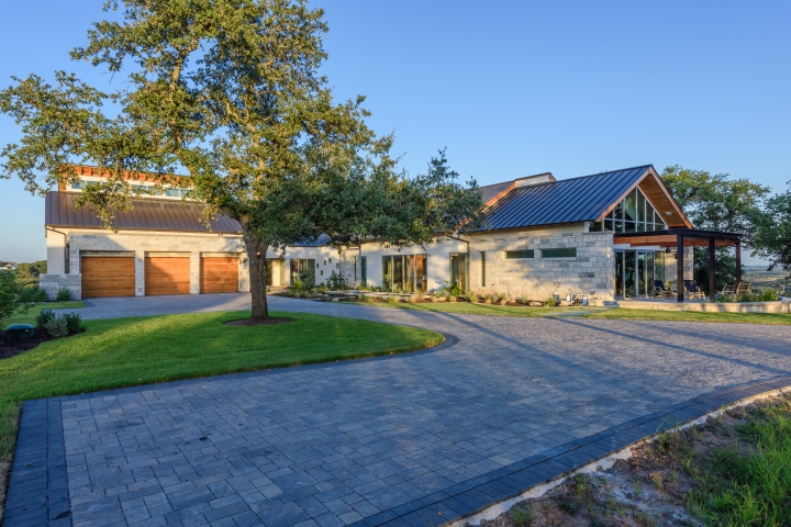
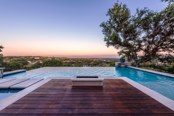
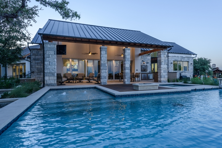
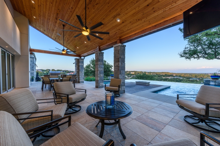
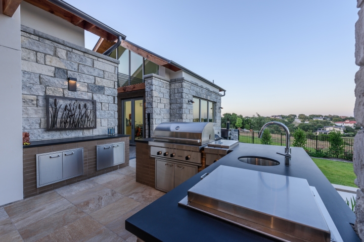
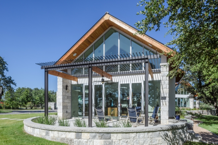
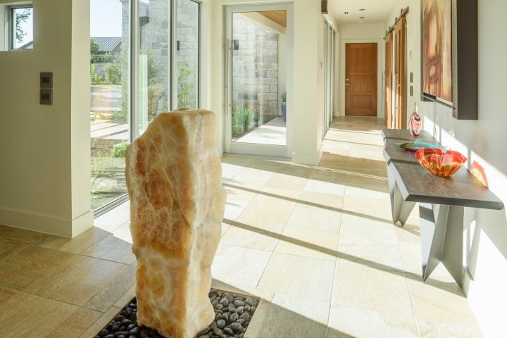
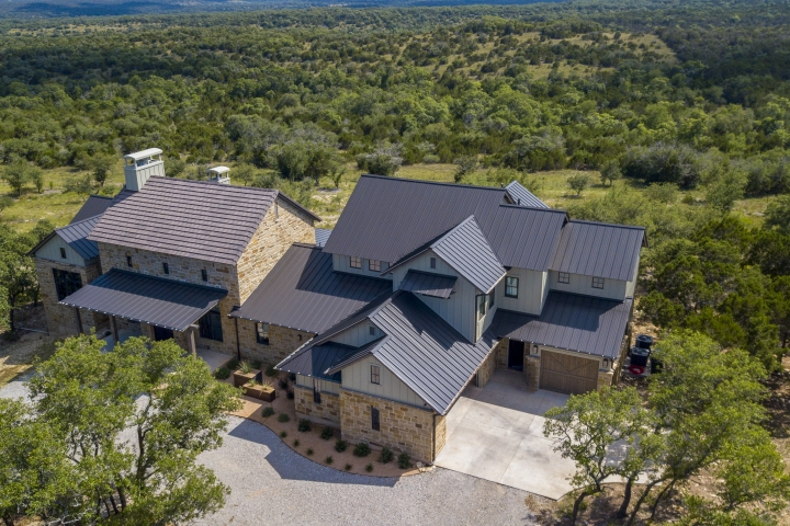
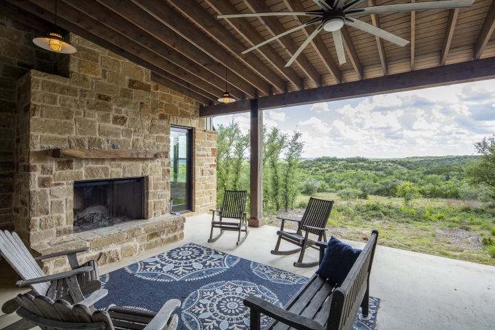
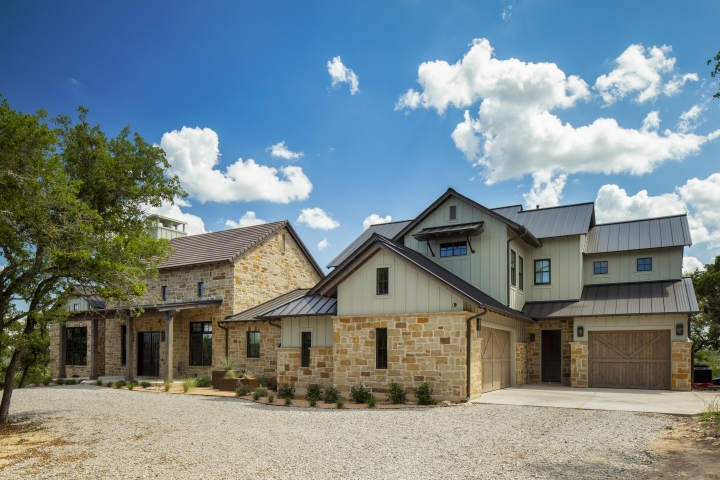
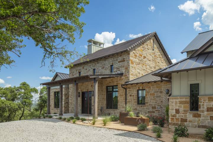
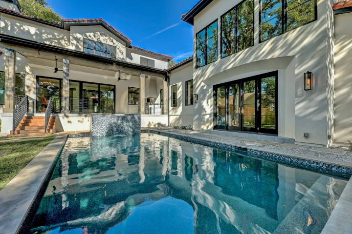
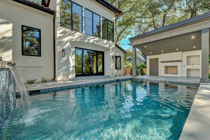
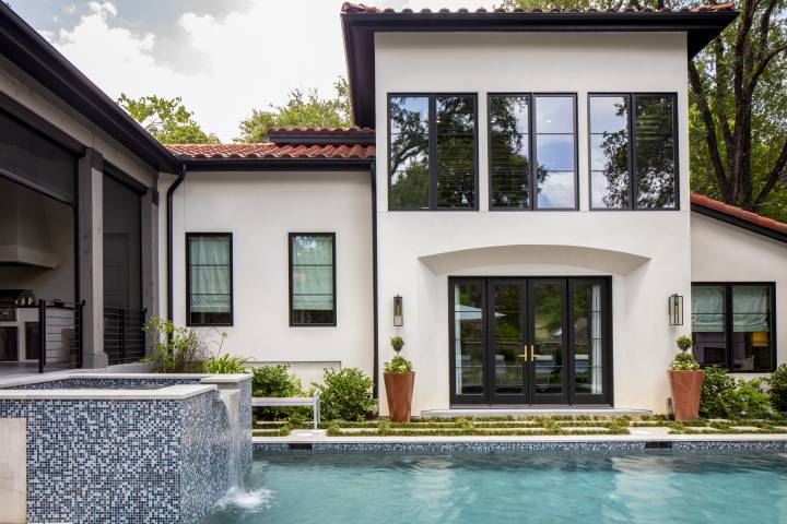
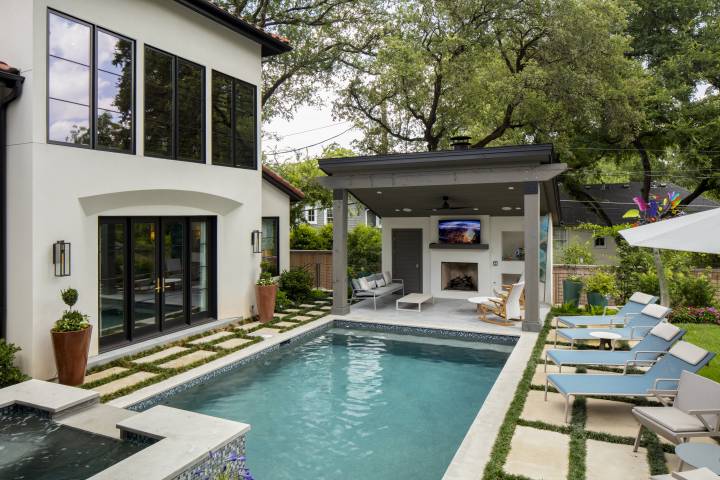
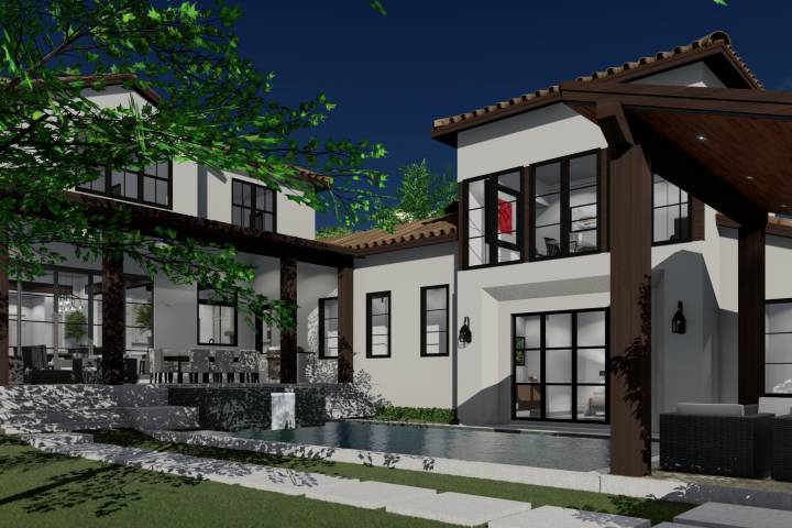
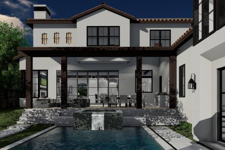
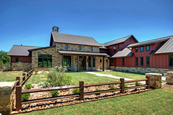
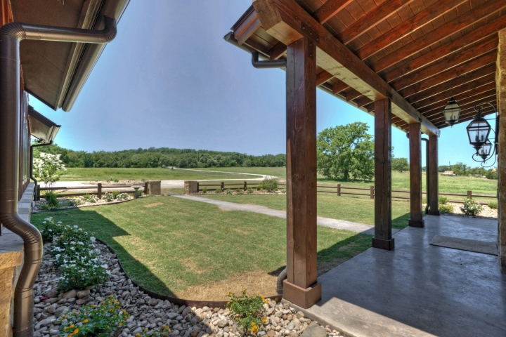
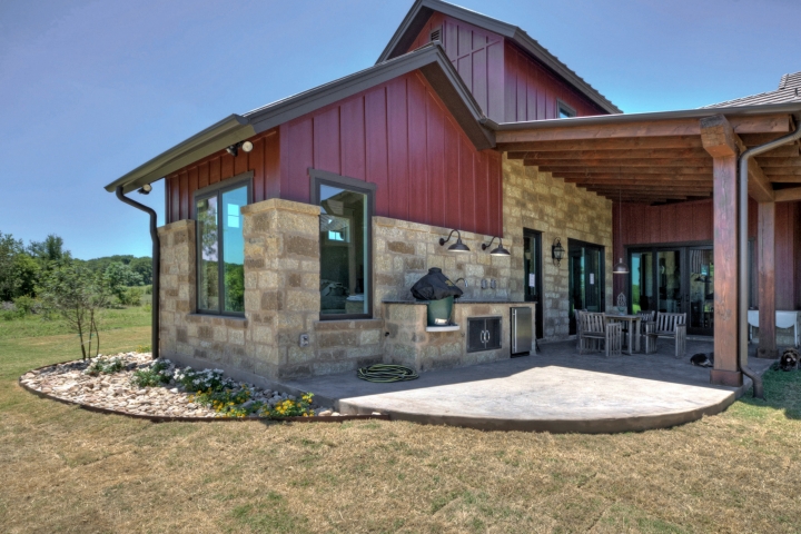
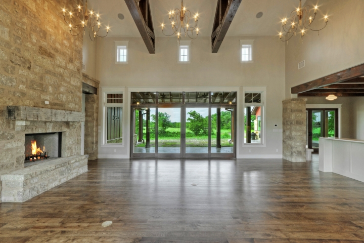
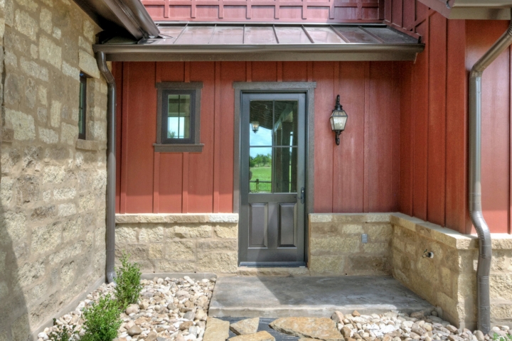
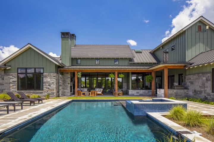
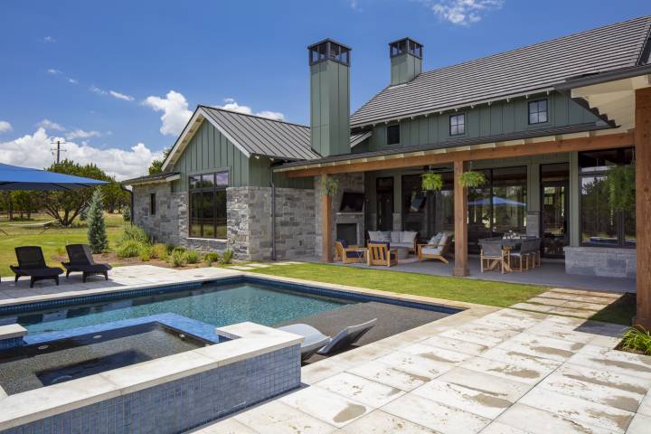
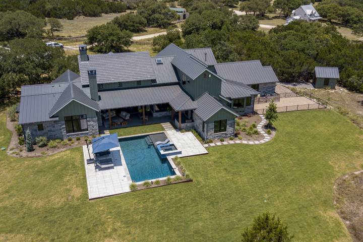
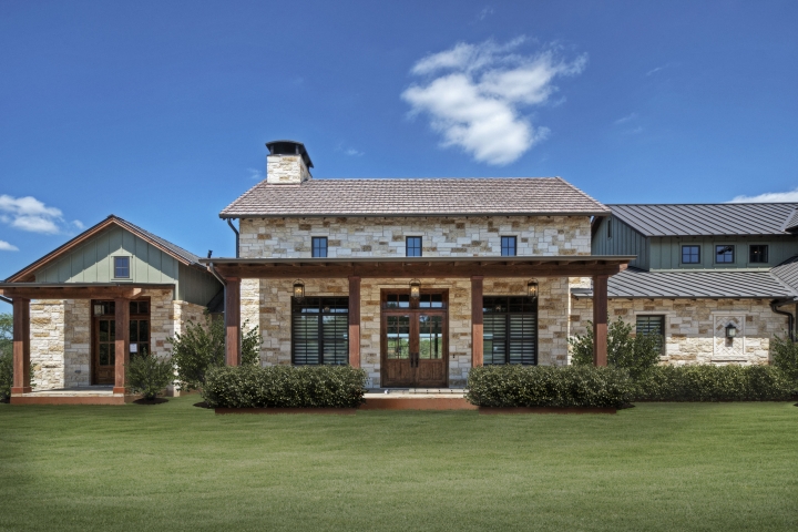
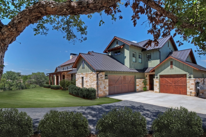
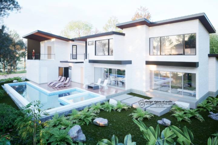
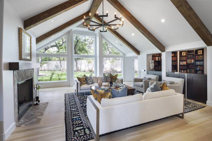
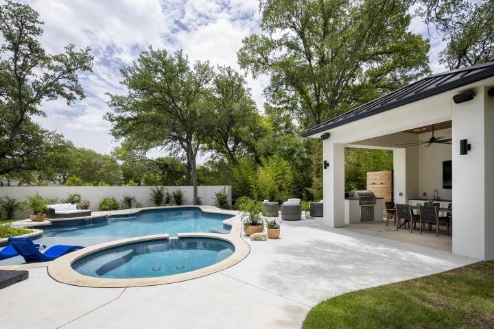
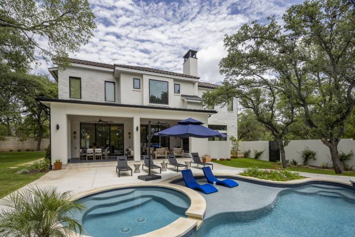
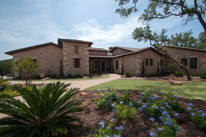
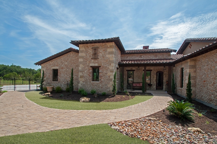
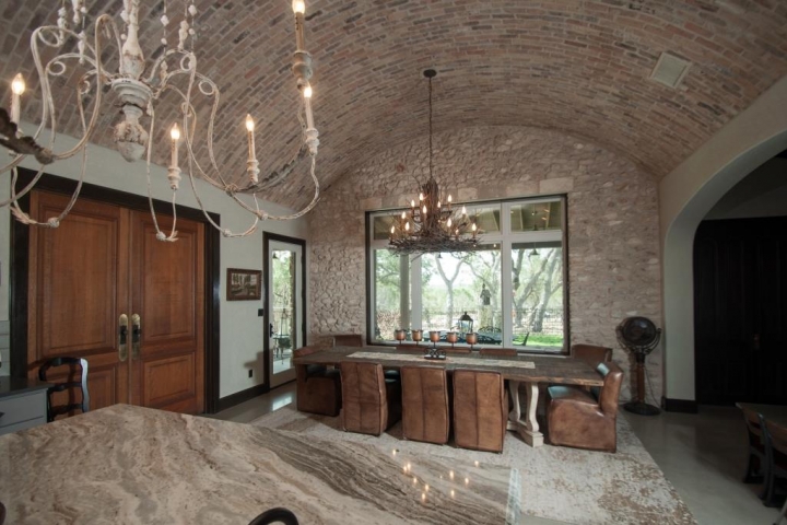
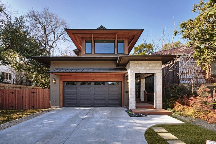
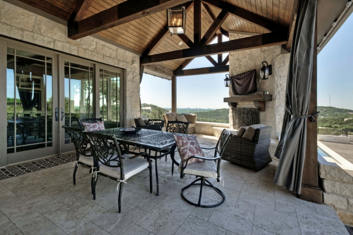
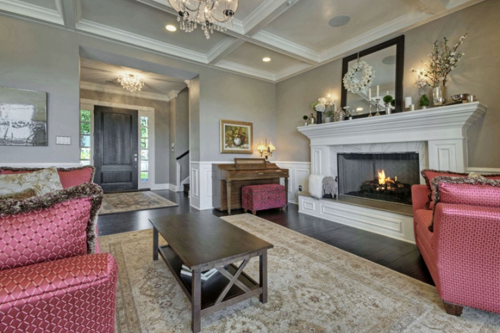
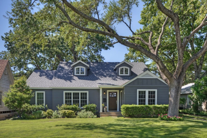
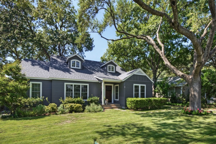
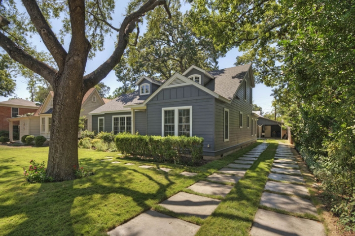
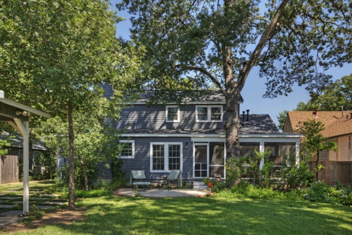
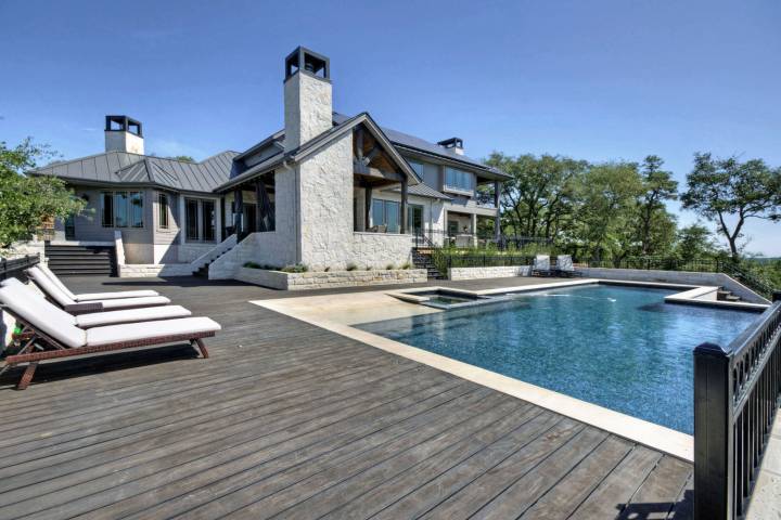
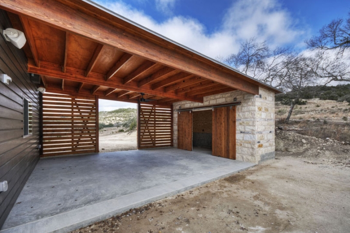
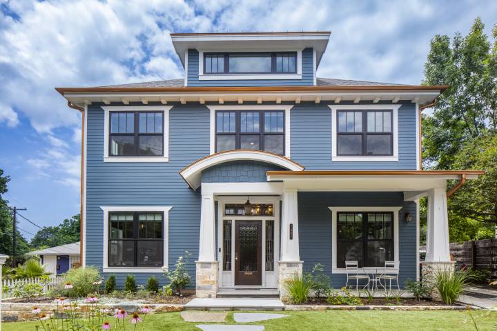
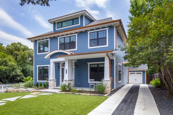
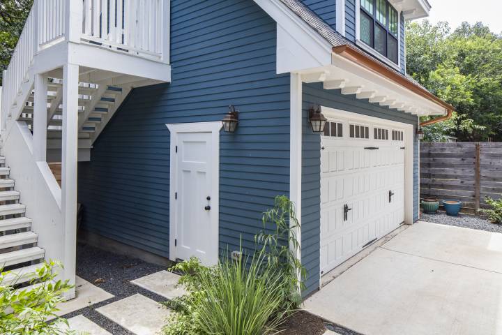
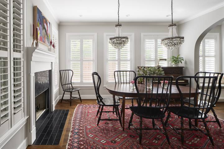
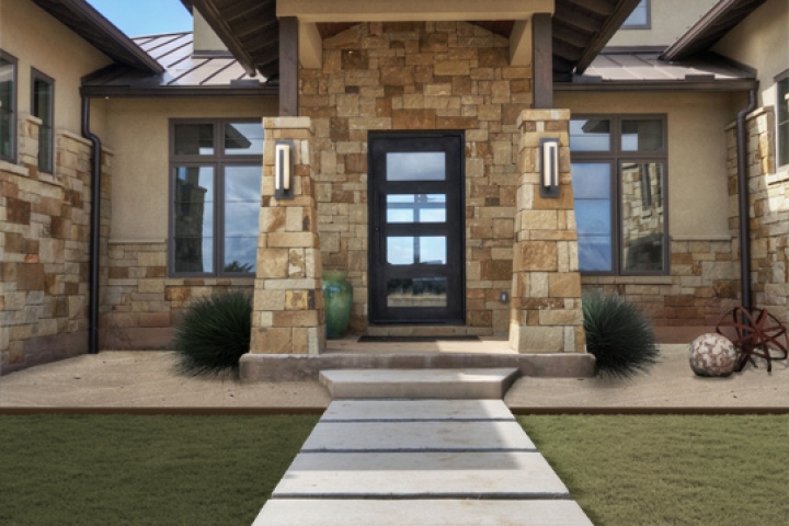
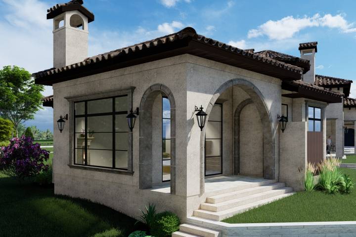
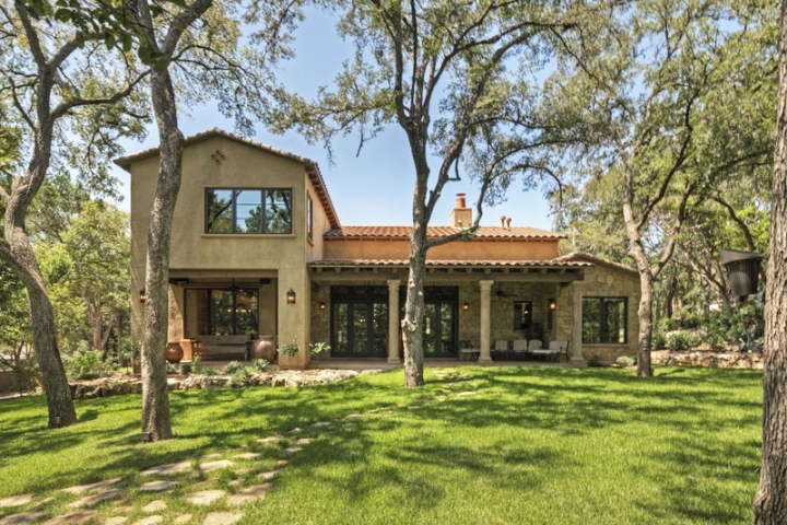
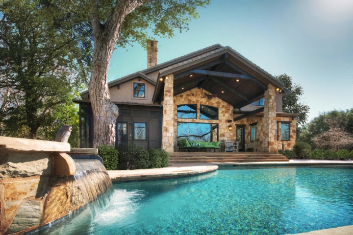
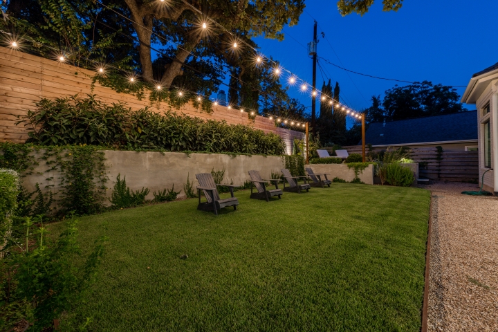
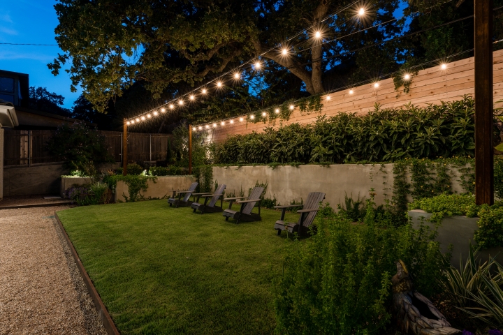
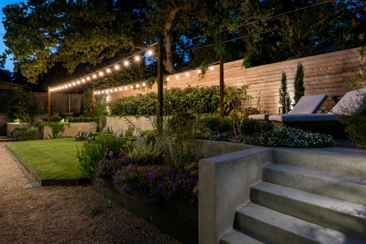
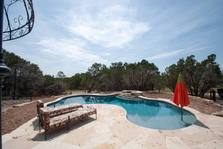
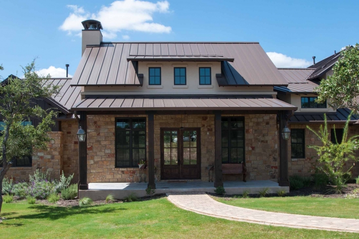
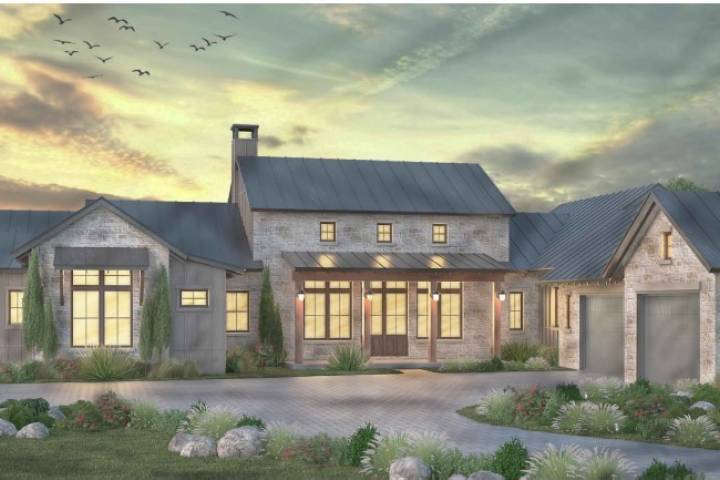
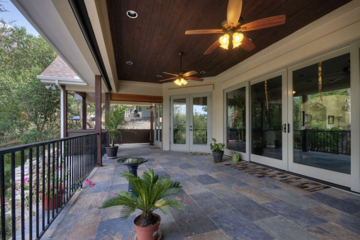
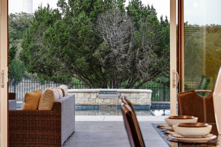
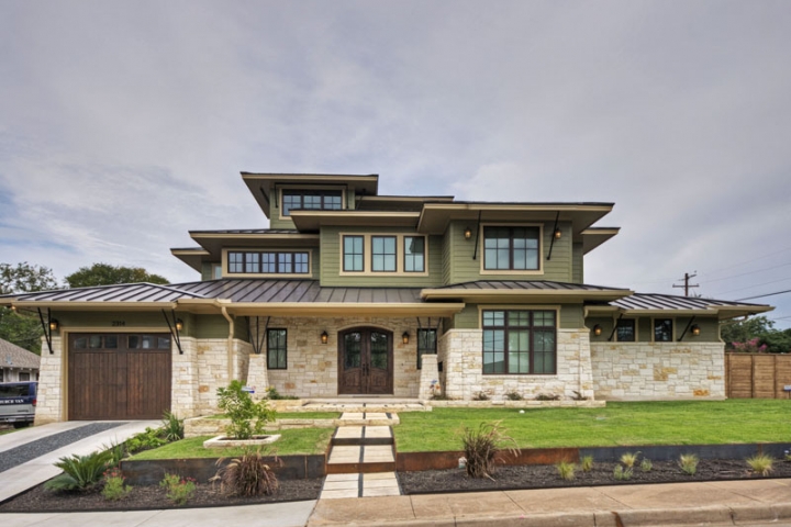
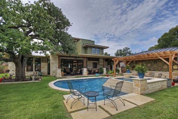
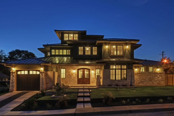
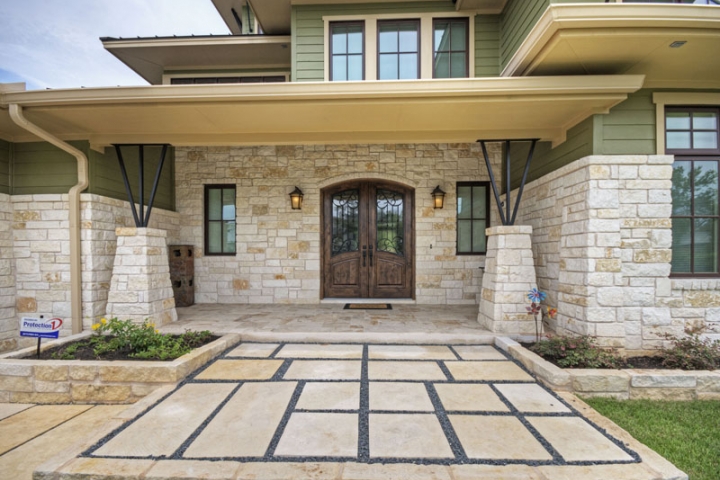
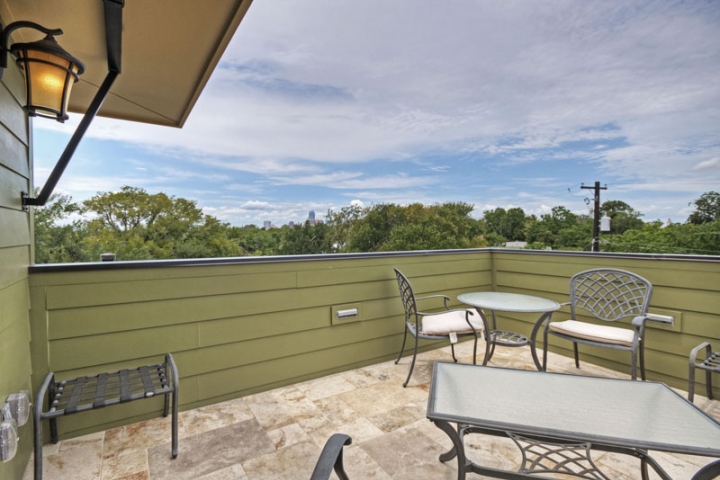
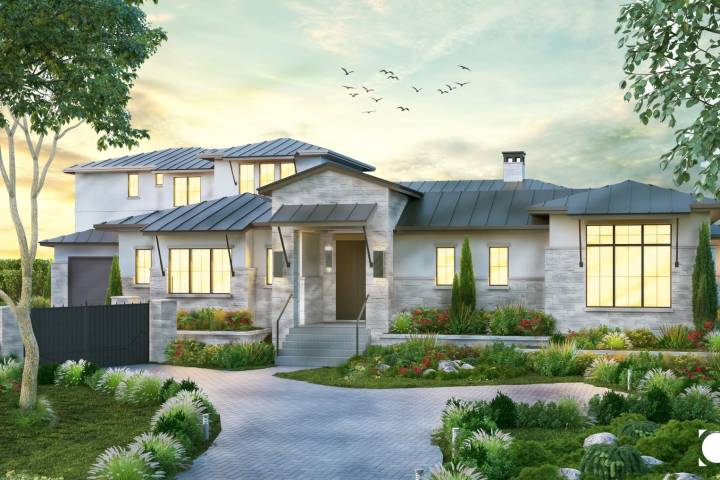
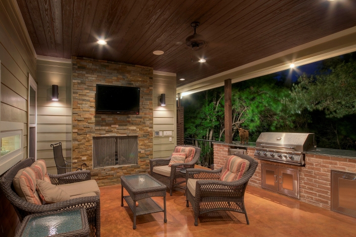
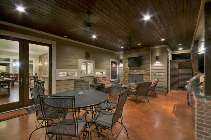
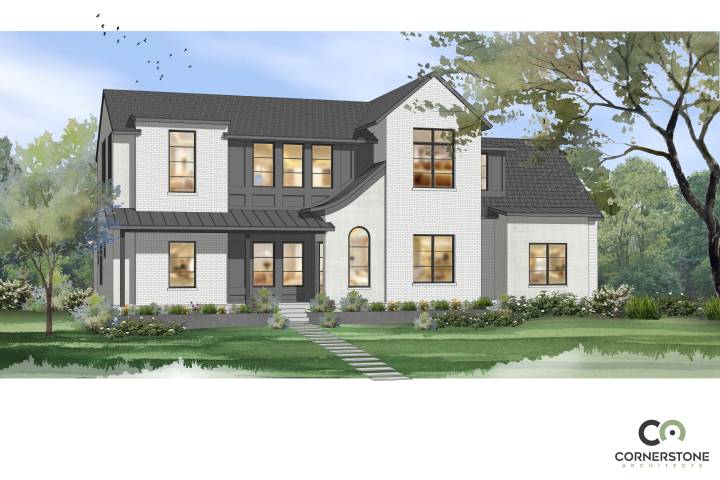
Designers are also creating distinctive exteriors by using strong contrasting colors. Part of the appeal of the modern farmhouse style is its black-and-white palette: It typically has white board-and-batten siding with a black or dark gray standing-seam metal roof. The juxtaposition is also very effective in combinations of cladding materials. Ashton Woods recently completed a house in Austin with dark brown siding and a base of pale beige stone. “The contrast is what makes it so eye-catching,” says Spicher.

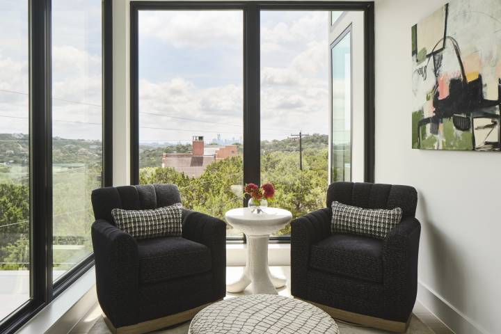
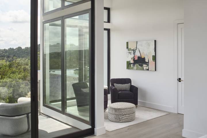
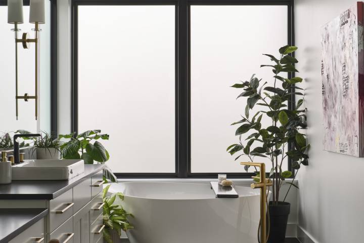
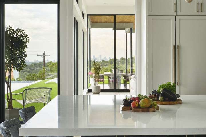
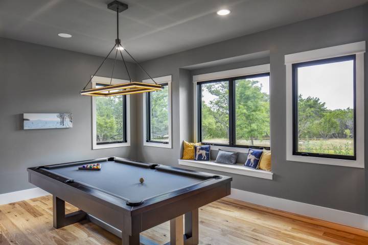
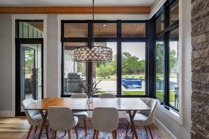
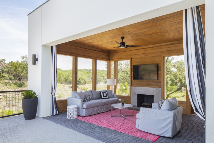
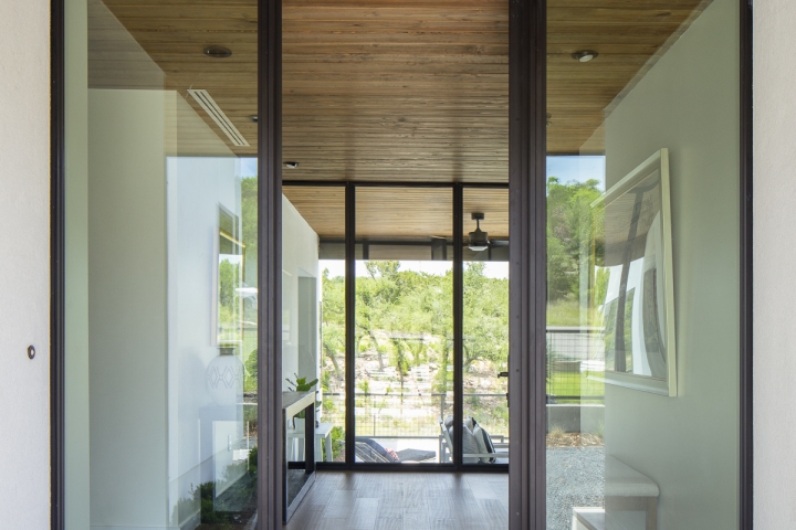
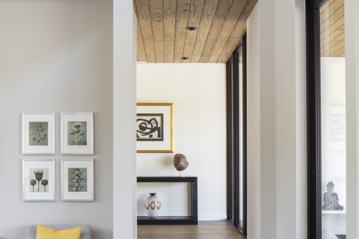
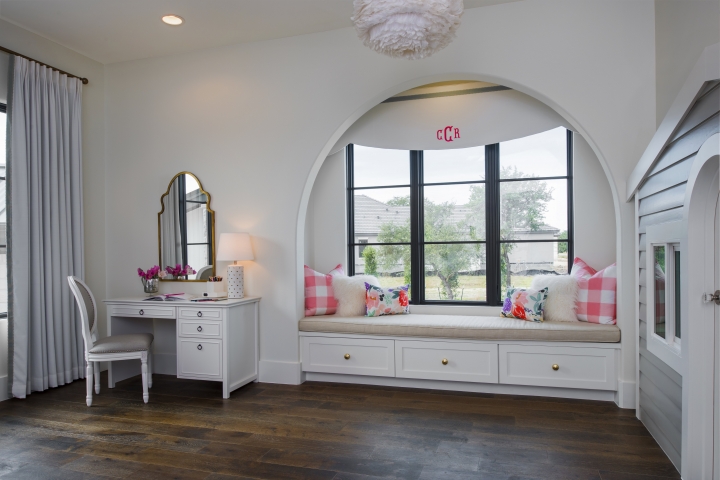
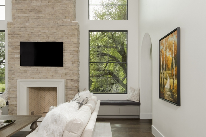
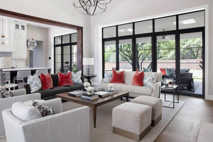
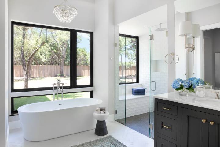
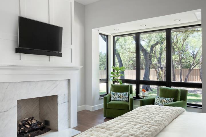
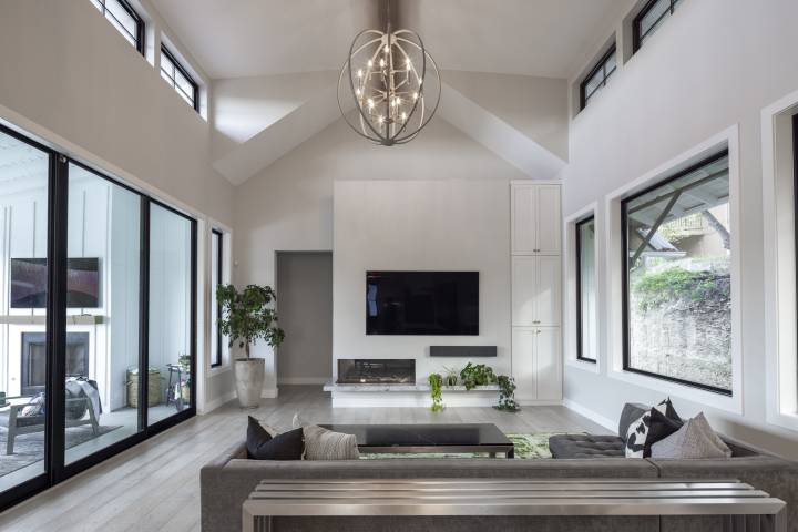
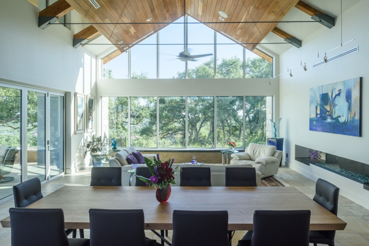
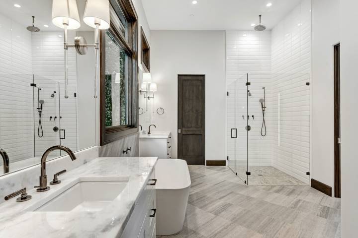
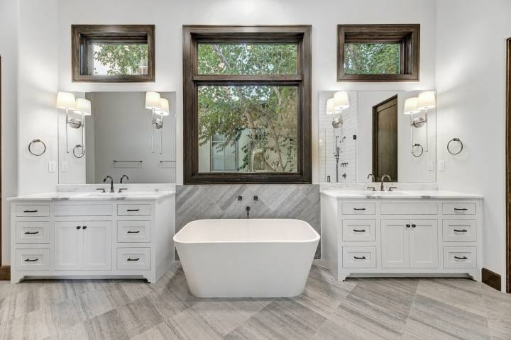
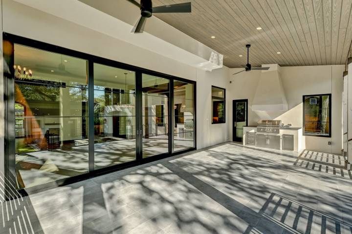
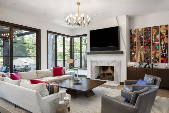
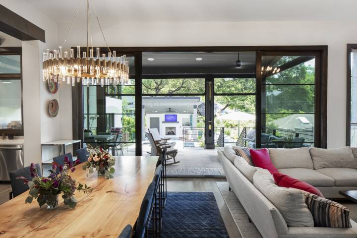
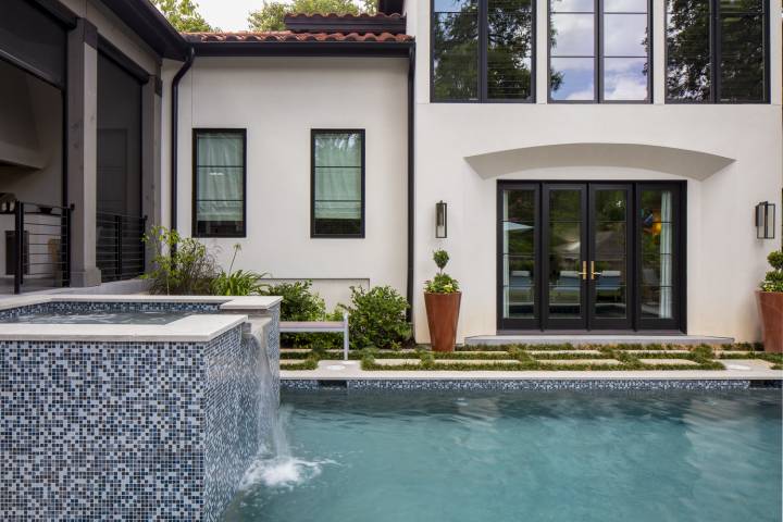
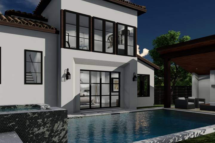
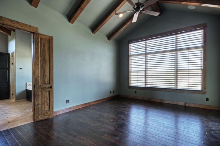
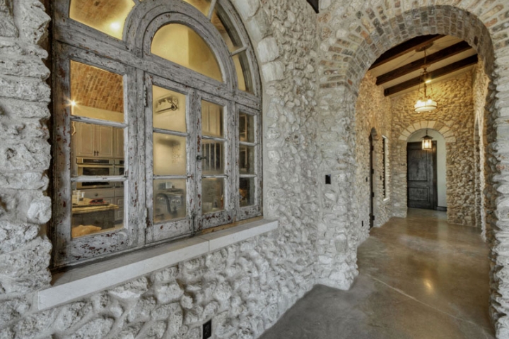
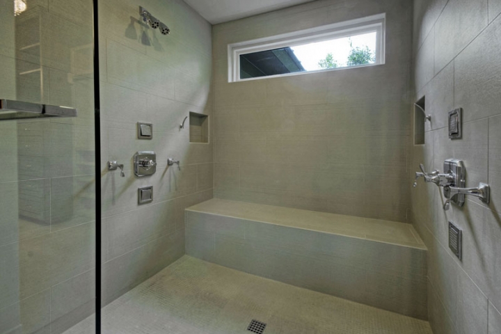
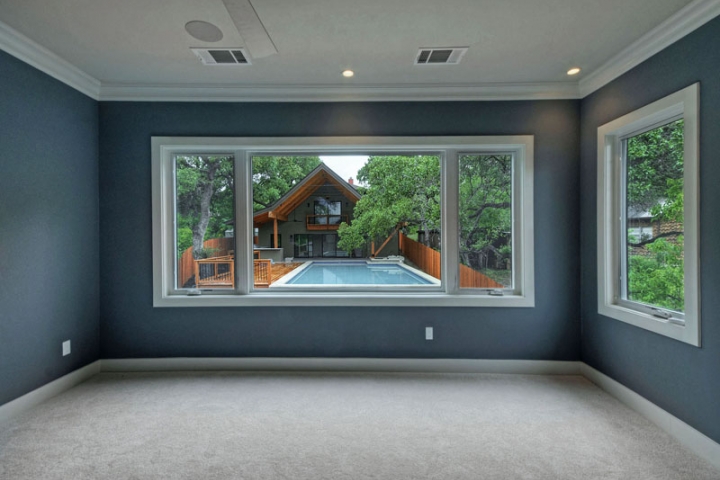
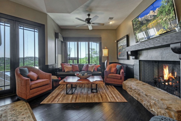
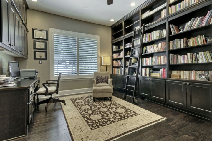
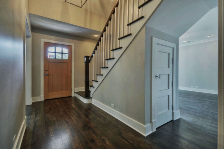
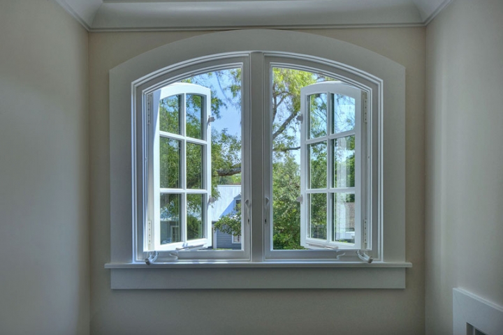
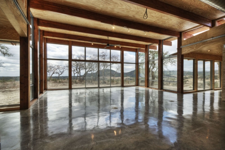
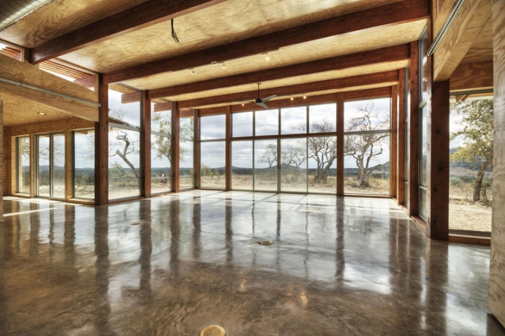
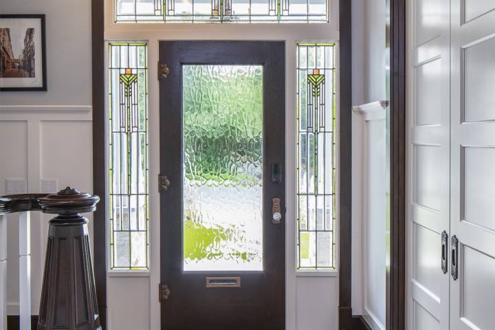
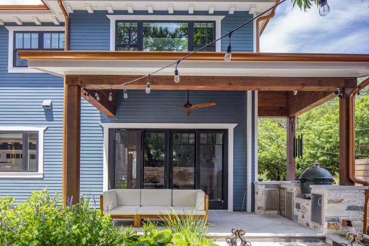
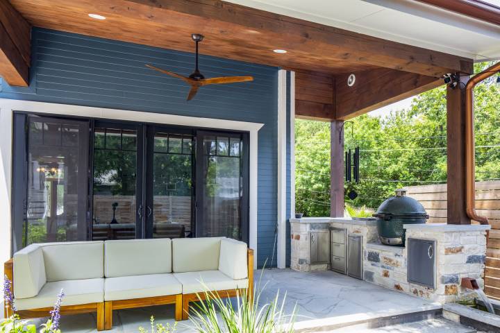
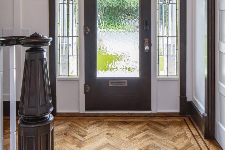
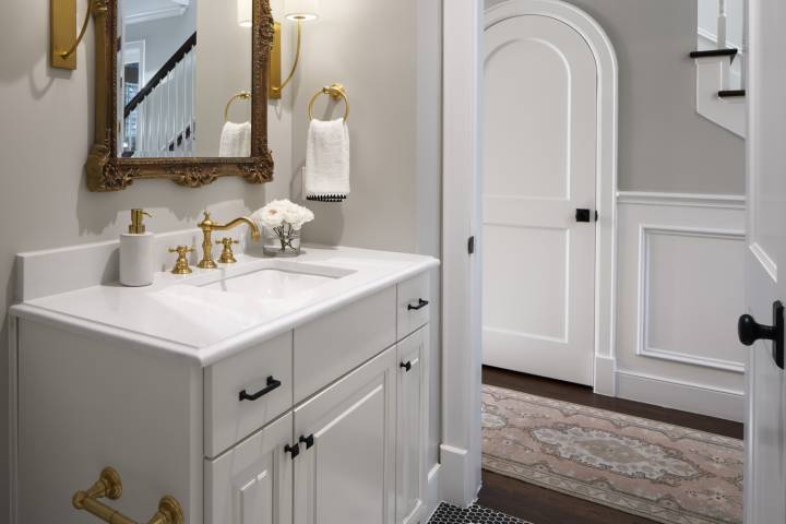
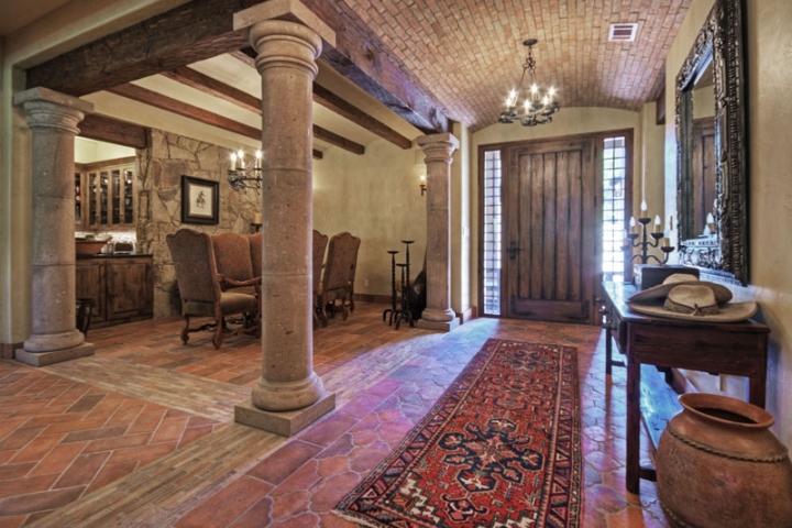
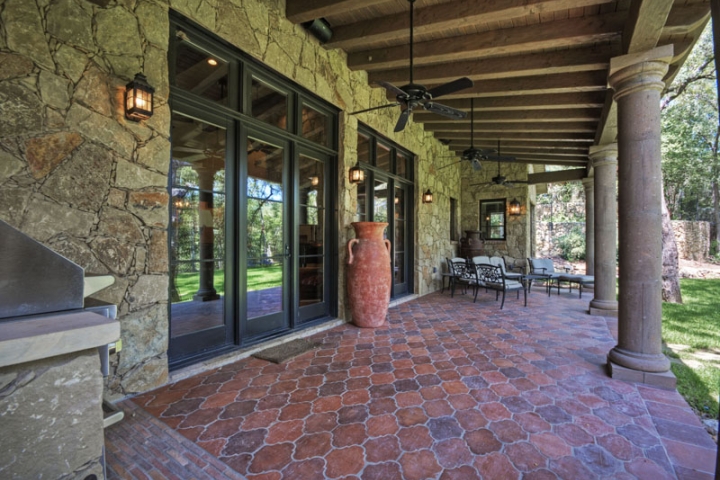
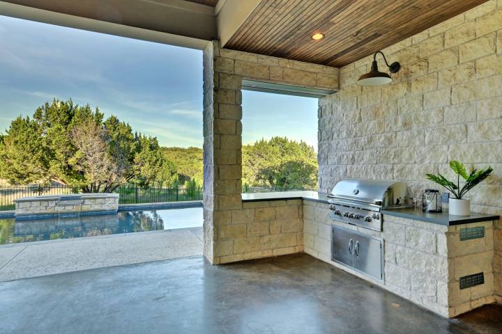
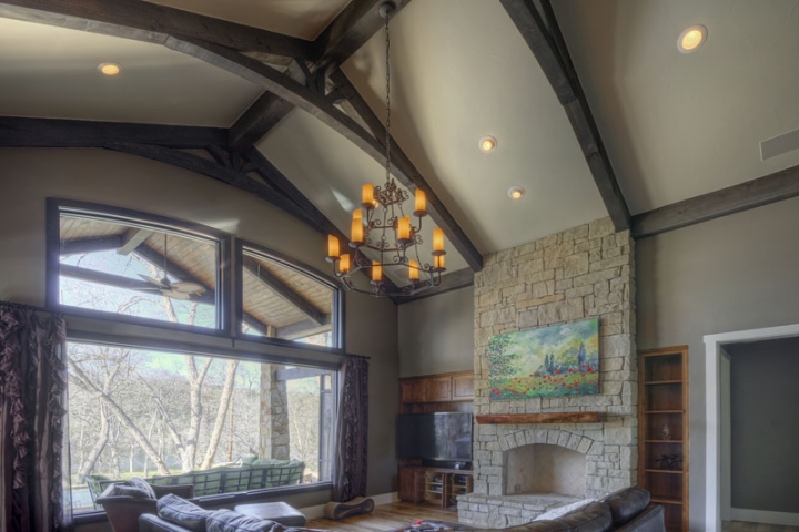
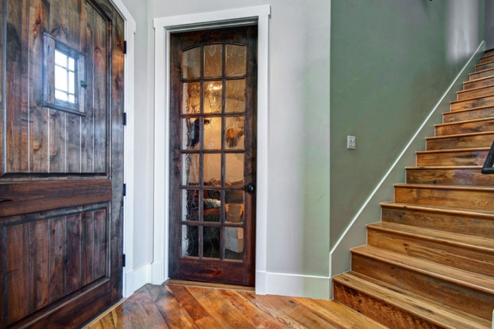
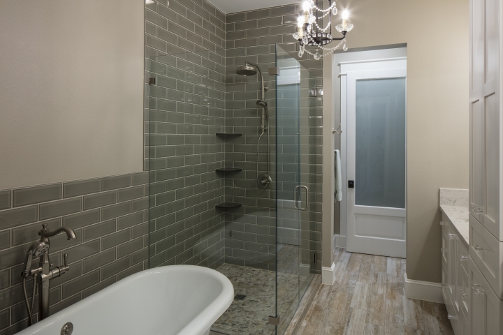
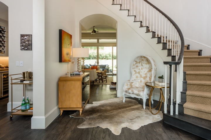
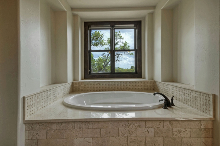
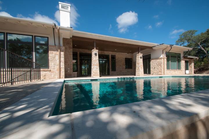
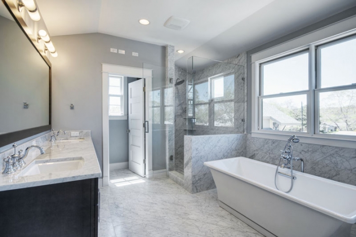
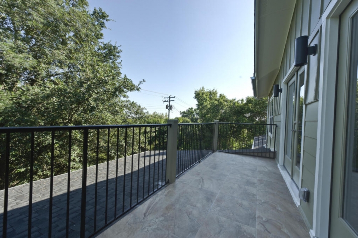
Another way to add a dark accent is to use black windows in lieu of default white windows, a trend that has been steadily gaining over the past several years. Reminiscent of steel factory windows, black windows are a natural fit for contemporary architecture, but they also lend an industrial vibe to traditional designs. Black windows strongly accentuate light interiors and exteriors.
“We’re seeing homeowners go one of two ways—they either pick finishes that blend in with their walls or that pop out, making the windows and doors the showstopper in a room,” says Jackie Schneider, vice president of marketing at Marvin. To get as close as possible to the thinness of pricey steel windows, aluminum framing is recommended. And window coverings need to be carefully considered, since black windows look best undressed and do not pair well with standard white blinds, according to color expert Maria Killam.
Beyond style, there is a compelling financial reason to add black to the home palette: According to a Zillow analysis of colors in homes that sold from 2010 to 2018, a black or charcoal front door increased a home’s sales price by 2.9%.
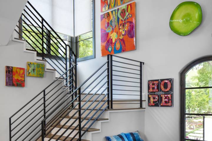
Insta-Worthy Interiors
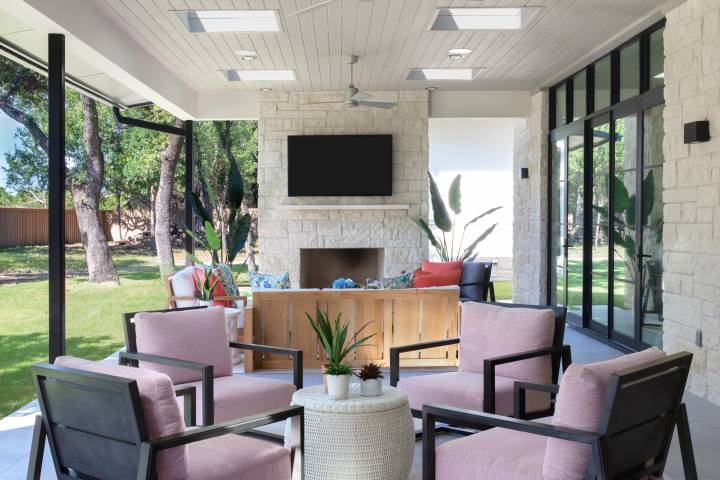
When paint companies and industry groups announce their colors of the year, their choices are a useful barometer of what colors the companies think will resonate with consumers. For instance, last year, Benjamin Moore selected Metropolitan Gray, a cool gray. This year, it settled on First Light, a pale pink, which the company bills as “a refreshing alternative to white or beige.” The consumer response has been enthusiastic, according to Hannah Yeo, color marketing and development manager at Benjamin Moore. “Before, everyone wanted to go gray and neutral; now, there’s finally color in the house. Gray might still be in the mix, but the proportion is different: maybe the interiors were 80% gray before, now they’re 40%.”
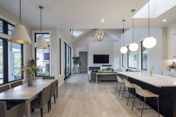
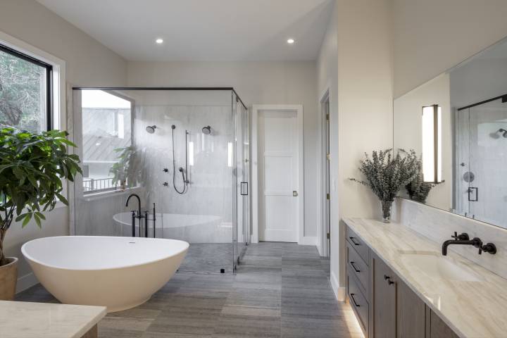
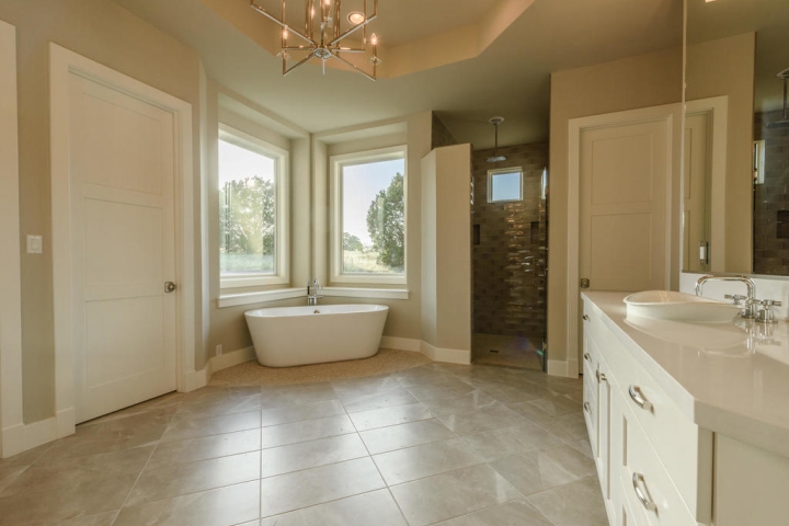
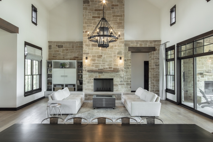
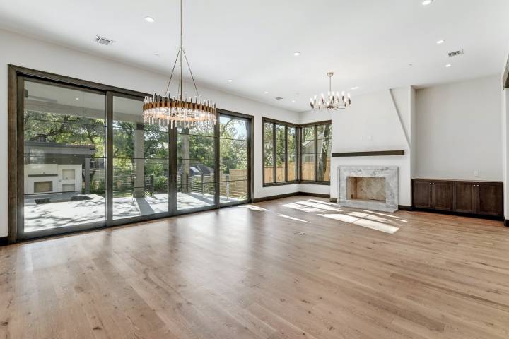
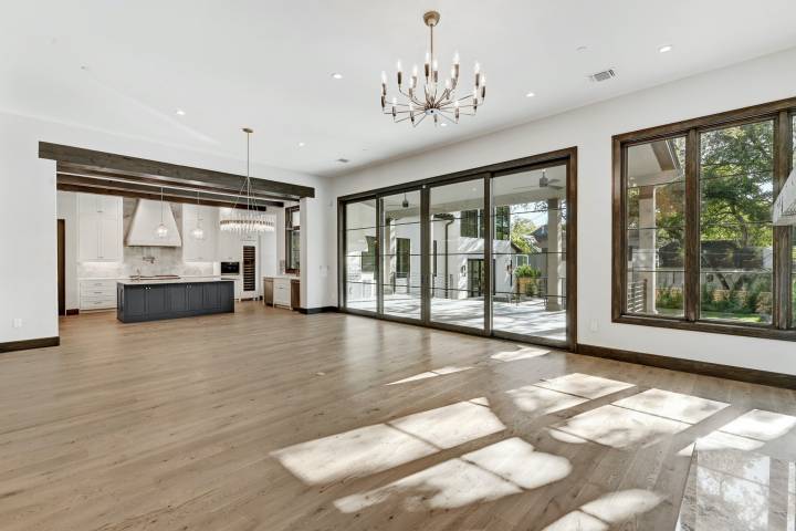
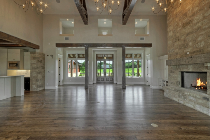
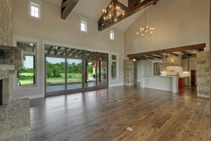
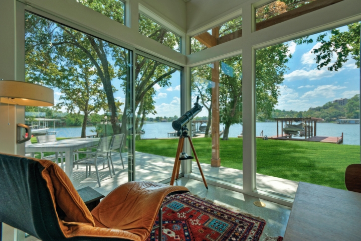
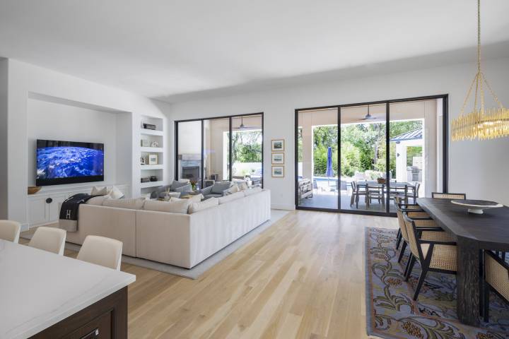
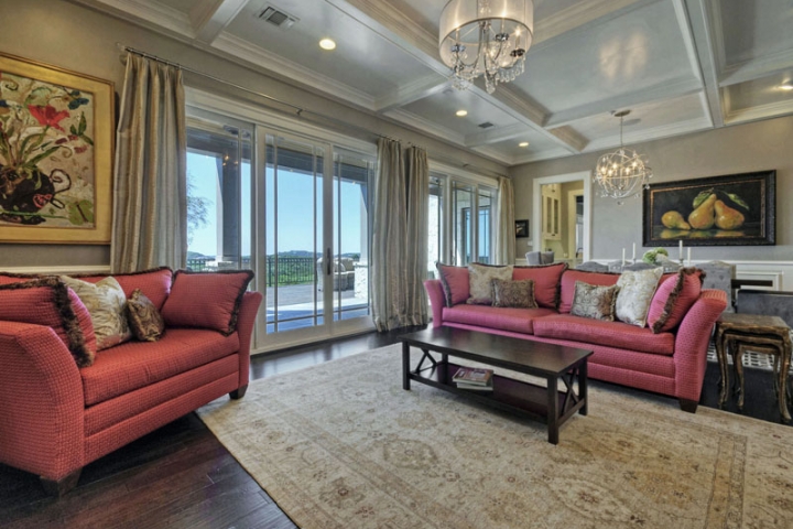
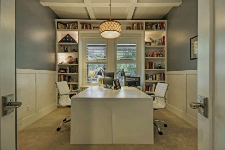
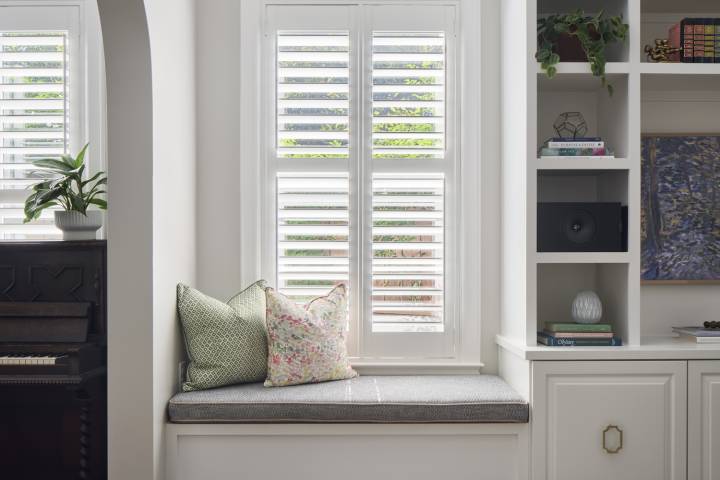
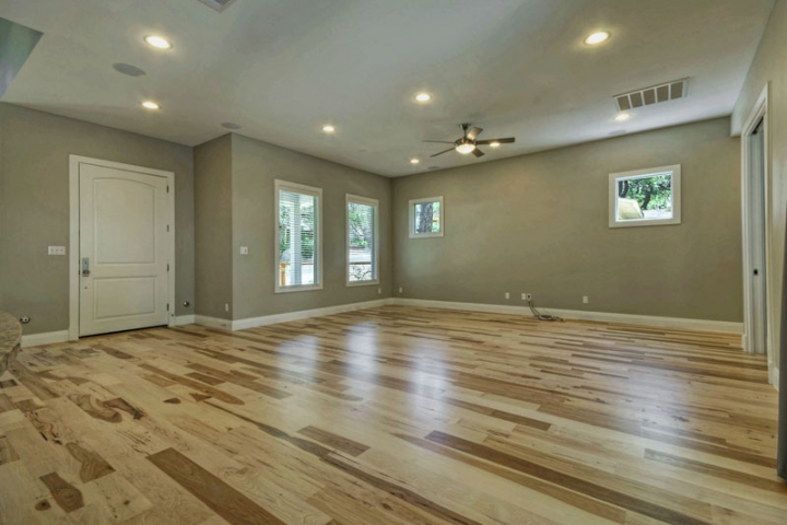
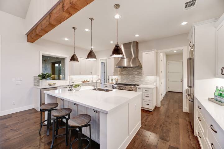
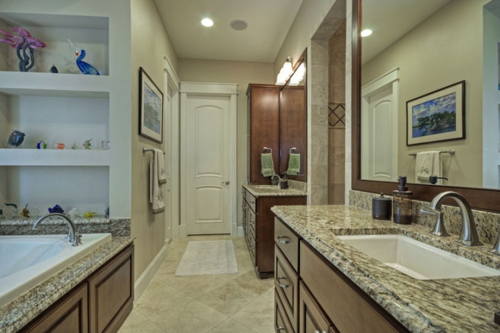
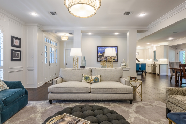
Going by image-conscious Instagram, classic white interiors continue to captivate. “Everybody wants a room that is light and bright, so err on the side of lighter colors,” says Michelle Marceny, founder of Denver-based Color Concierge. However, using the same shade of white in all rooms may counter the desired effect. “Stark white can be dangerous when it’s used in a darker room, because the shadows go gray and the space is going to look a little dingy,” says Marceny. Instead, for darker spaces like east- and west-facing rooms, she recommends picking a light greige like Benjamin Moore’s Classic Gray or Sherwin-Williams’ White Duck, with a reflective value between 70 and 80, to create a more balanced effect. Yeo at Benjamin Moore suggests layering whites for a stylish effect. “There’s a huge trend putting white and white together. For instance, you could do a bright white trim and a softer gray white on the walls.”

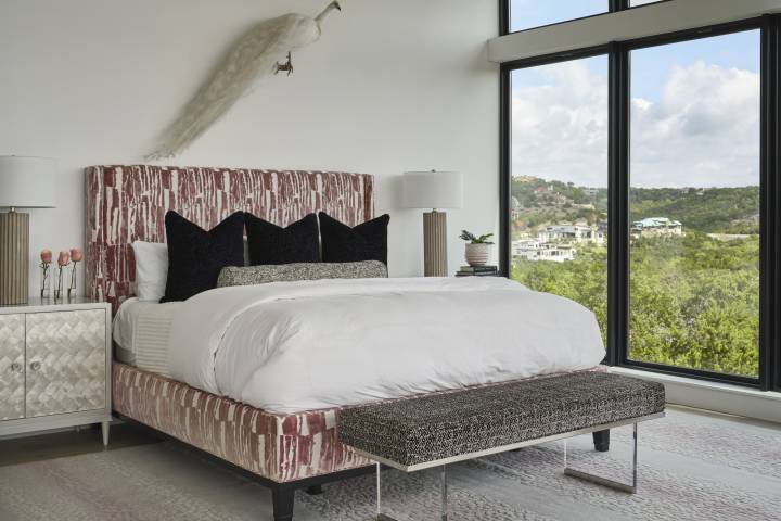
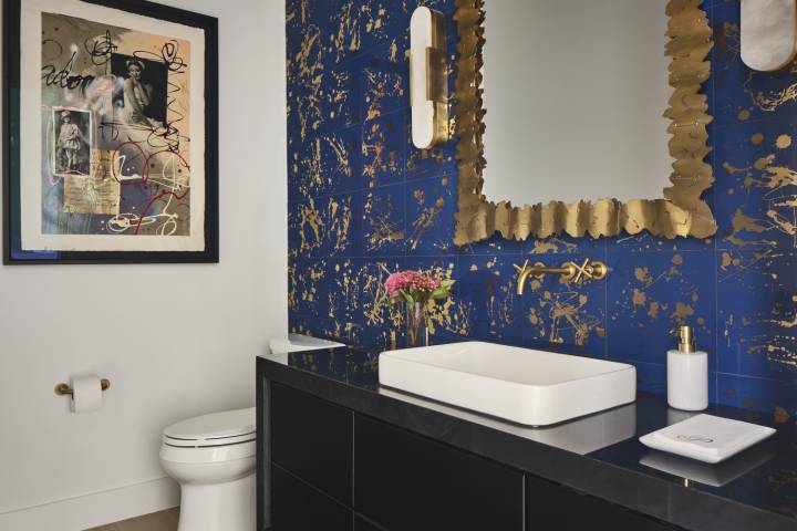
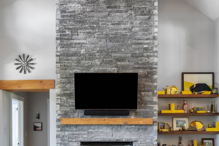
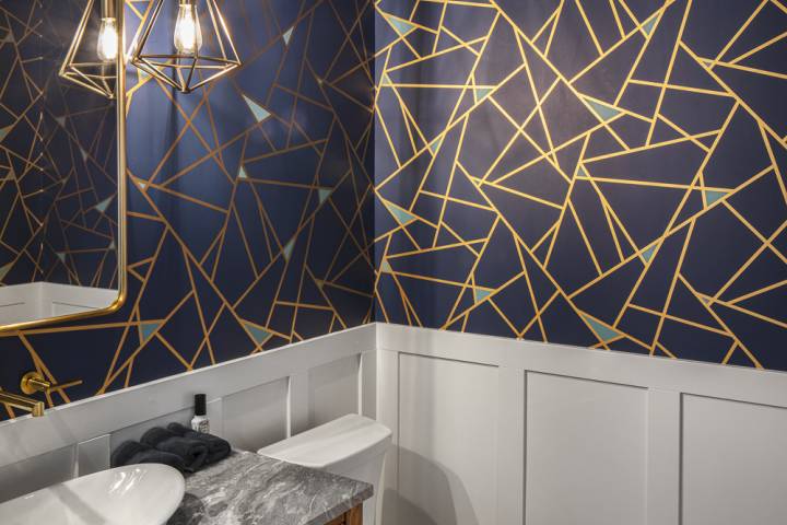
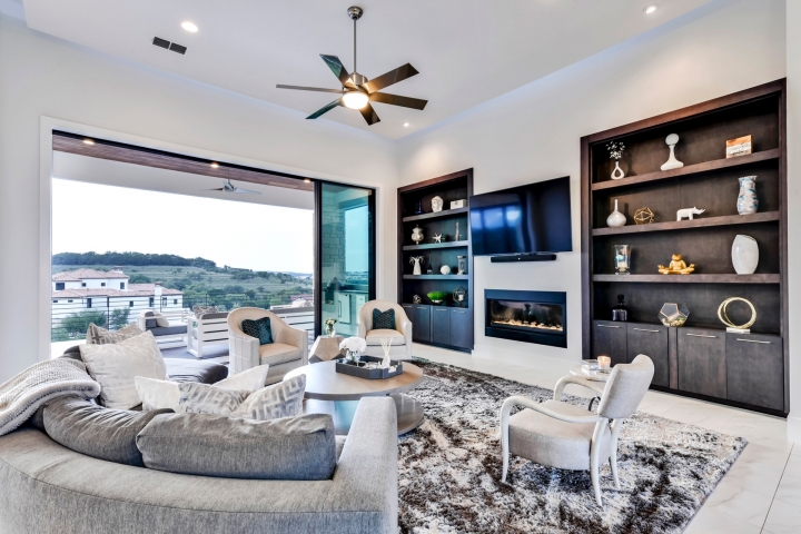
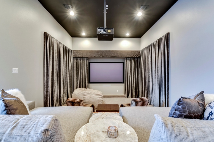
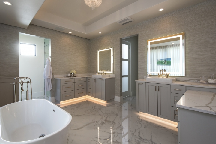
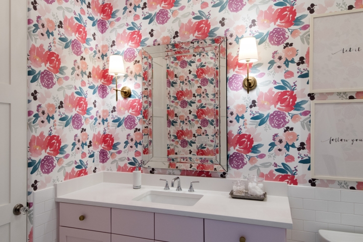
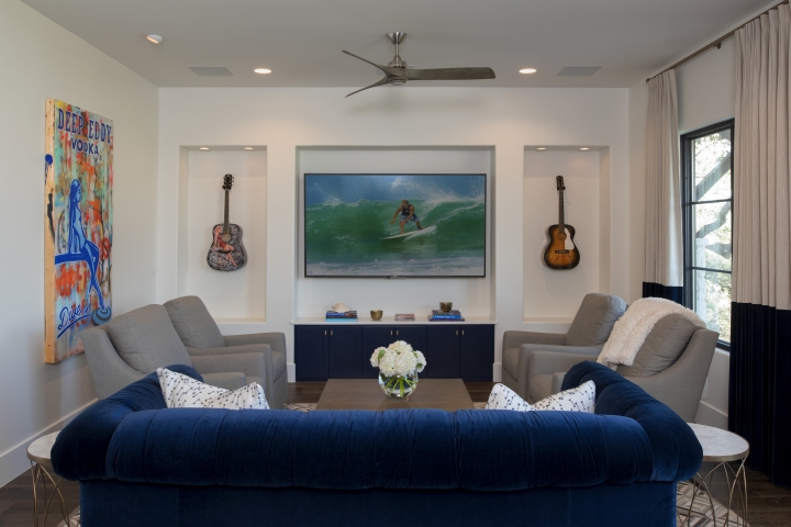
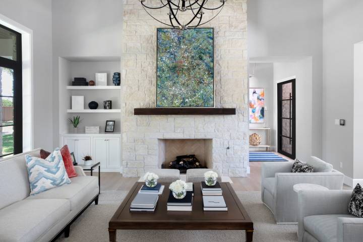
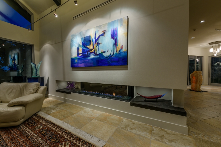
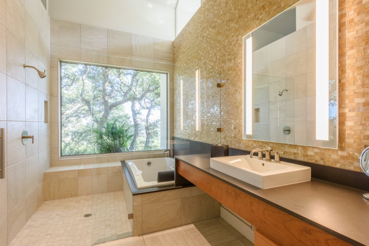
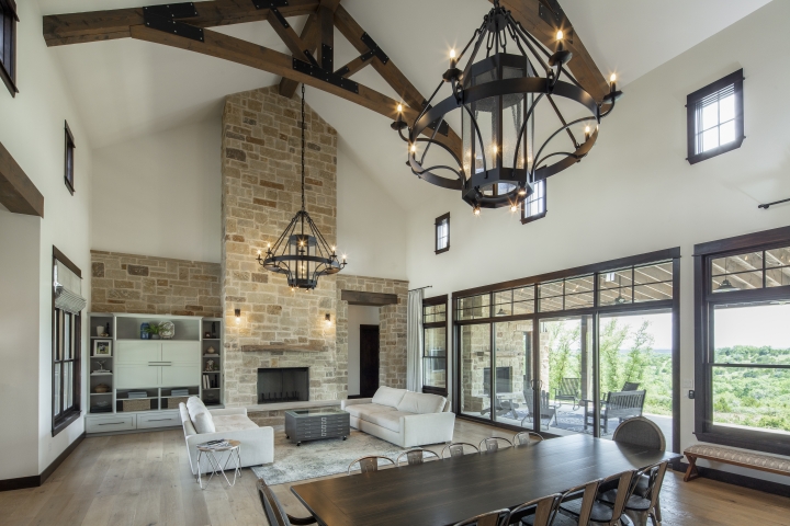
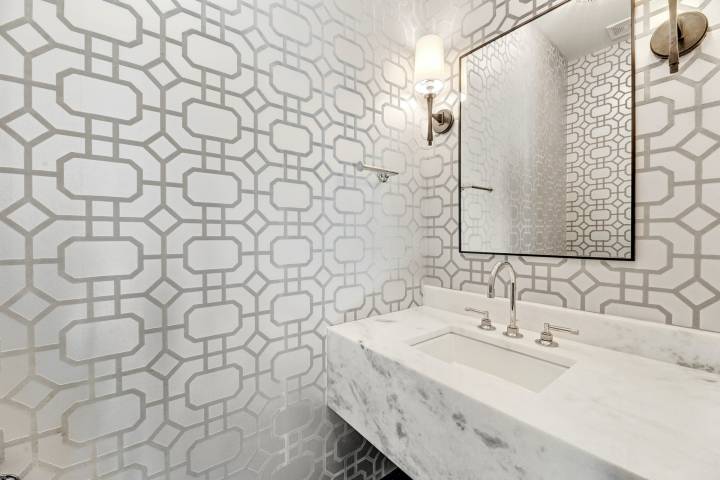
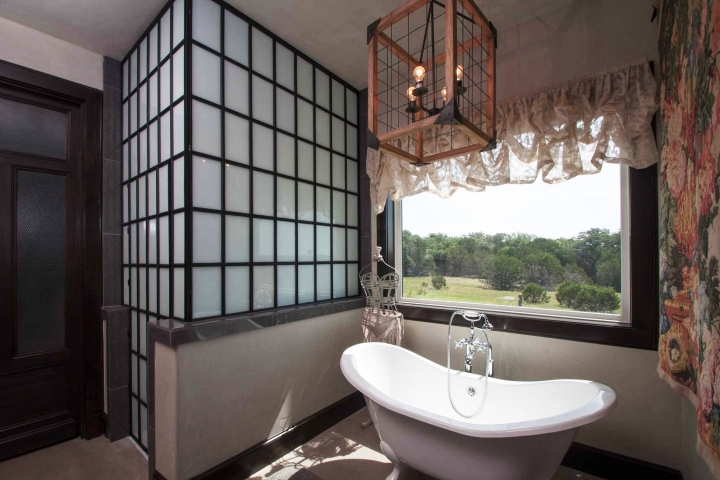
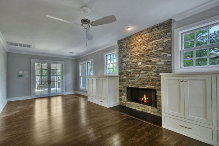
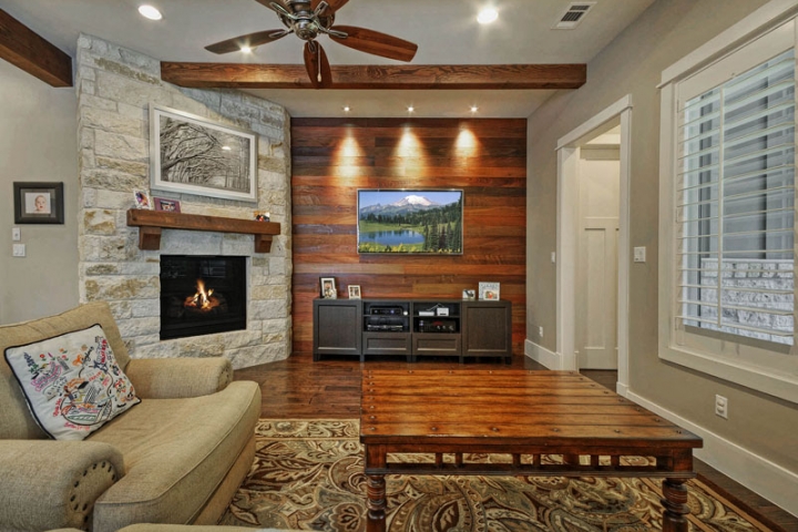
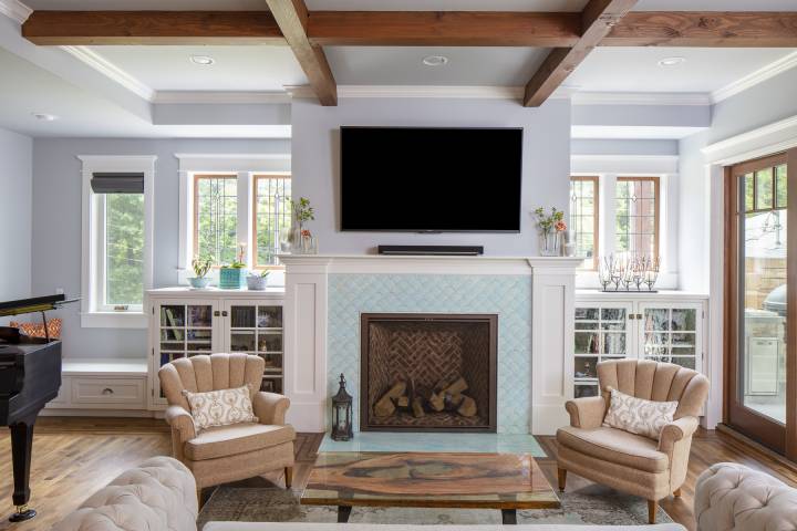
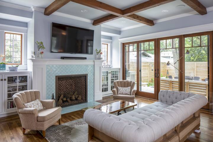
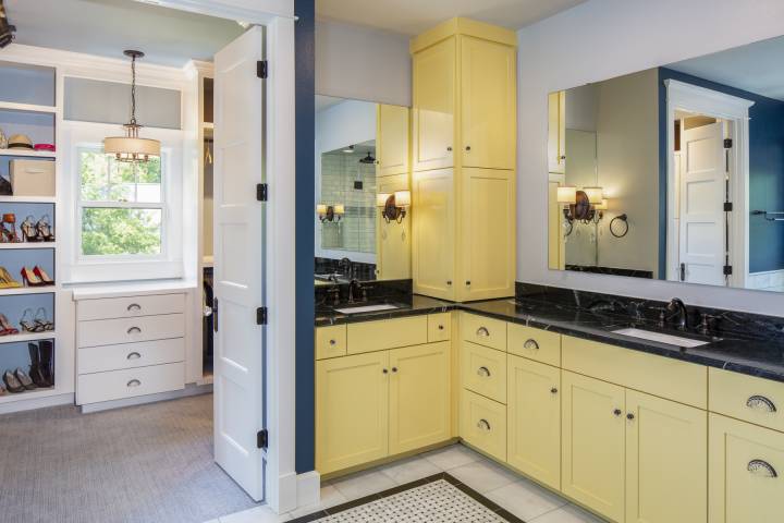
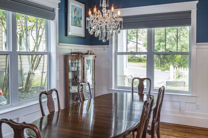
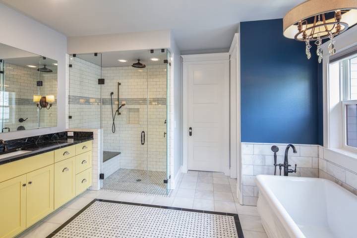
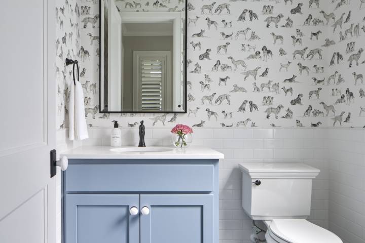
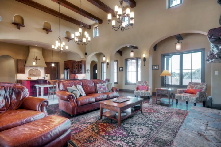
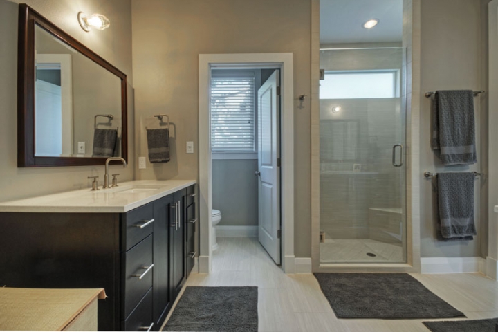
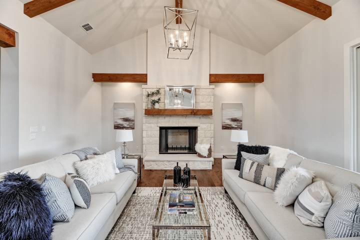
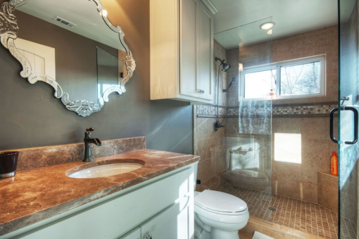
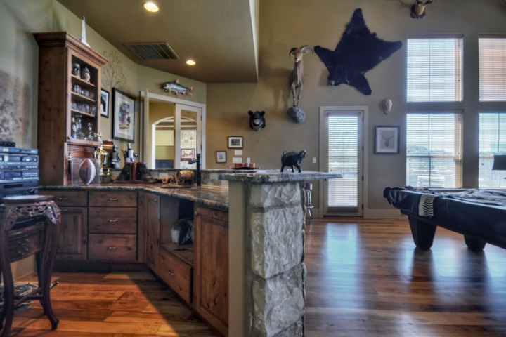
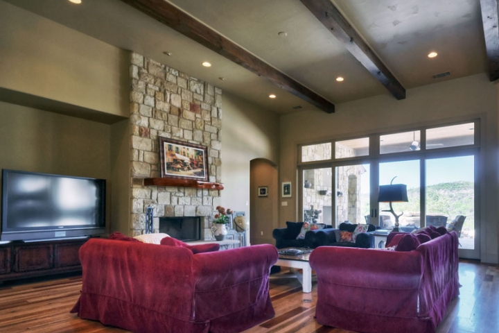
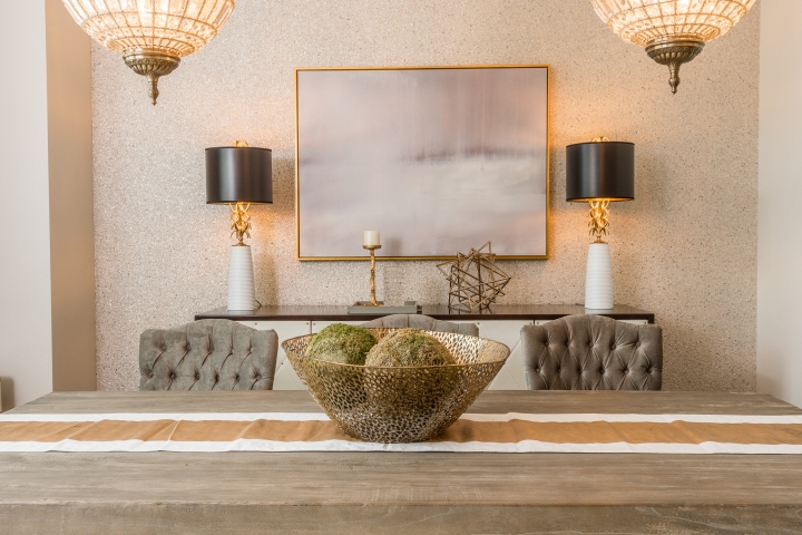
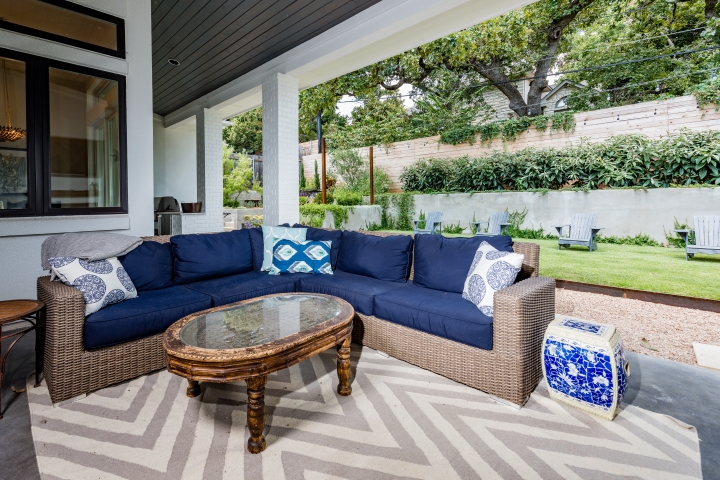
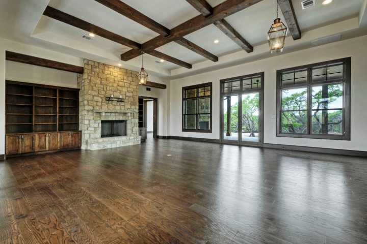
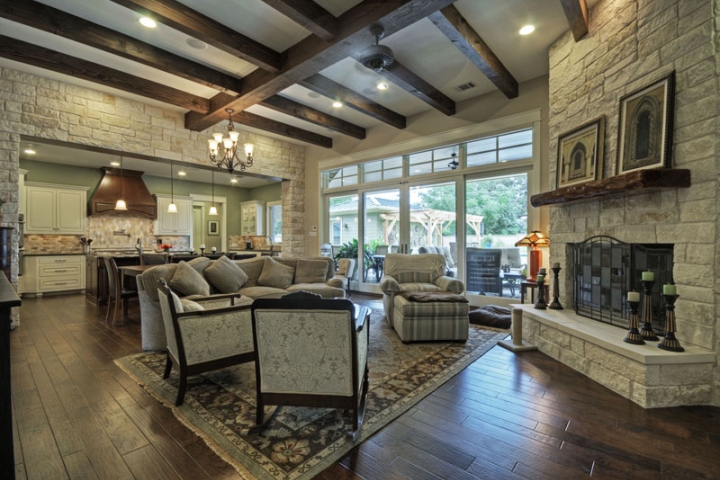
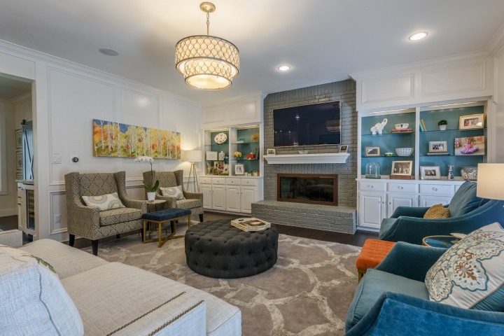
To make a room really pop, some luxury interiors feature dark and even black walls. The somber shades create a high-impact backdrop, but also absorb a lot of light, so this editorial look requires a lot of light to pull off. They lend glamour to dining rooms and powder rooms (a designer’s favorite spot to experiment with design), and are useful for giving traditional architecture a modern twist. For instance, for a master bath in Portland, Ore., designer Emily Henderson lined the walls with classic wainscoting. But instead of white, she painted it in Sherwin-Williams’ Cyberspace, a deep navy. “Paneling can be tricky because you want it to feel modern and still a little edgy and not like an ’80s country revival,” Henderson writes on her site. “So we went dark and we love it.” A dark wall also helps a large television disappear into the background.
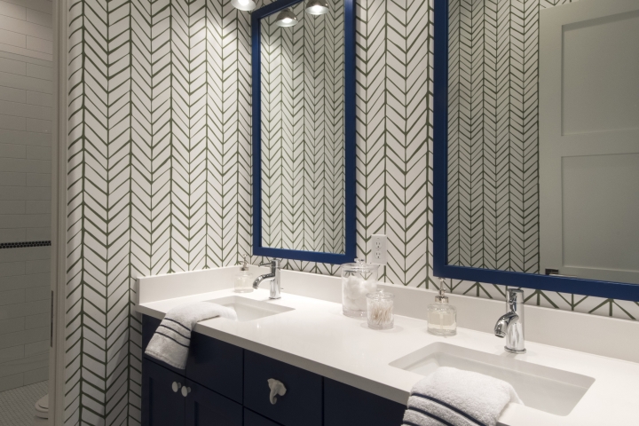
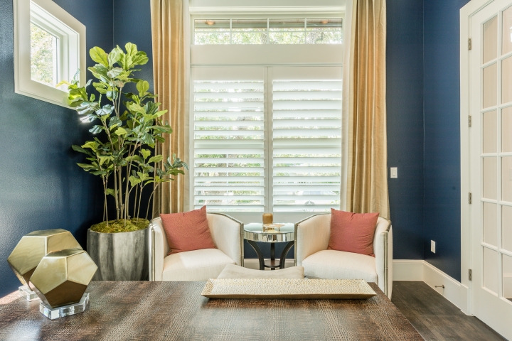
Among dark hues, homeowners could consider the consensus choice for color of the year: navy blue. The calming, grounding shade is not only Pantone’s choice (Classic Navy), but also that of paint companies Sherwin-Williams (Naval) and PPG (Chinese Porcelain). “Consumers are tiring of stark grays and are looking to infuse colors that delight the senses,” says PPG senior color manager, Dee Schlotter, on the company’s website. “Blue is the easiest possible entry point from the world of neutrals to the world of color.”
In keeping with the trend, window and door manufacturer Jeld-Wen recently released prefinished steel and fiberglass doors in Sherwin-Williams’ Revival Blue.
Putting on the Ritz
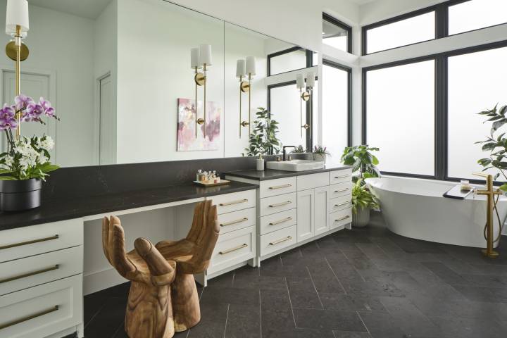
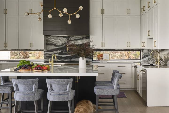
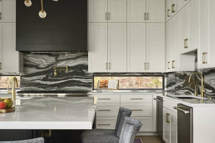
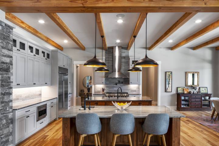
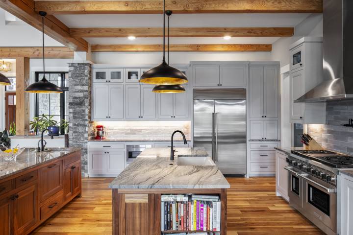
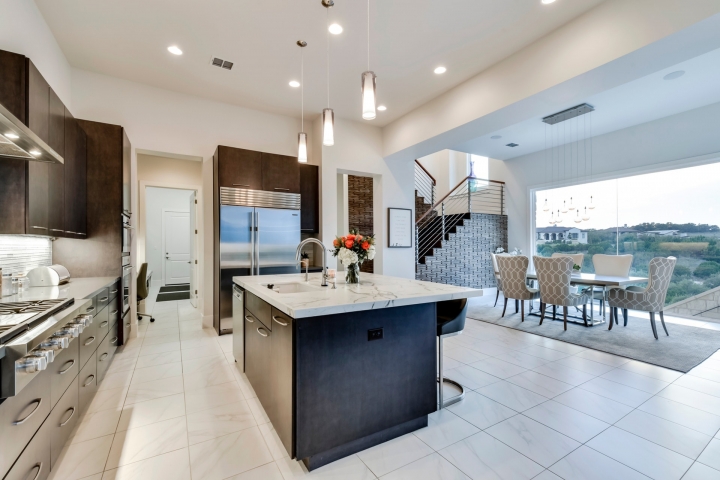
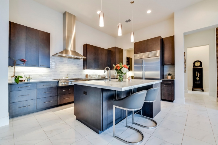
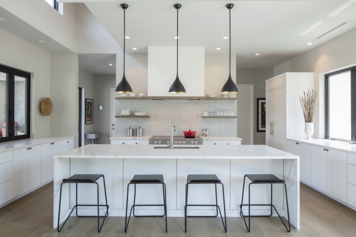
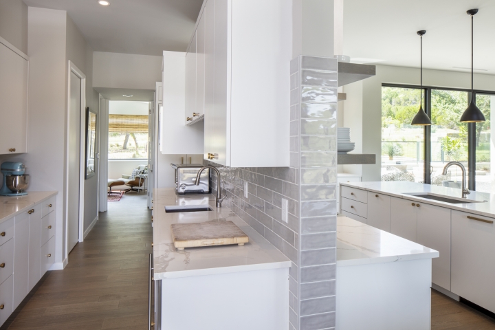
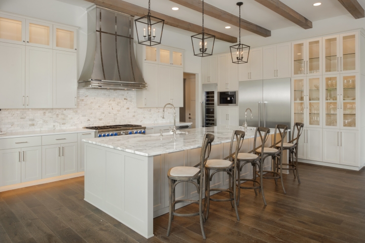
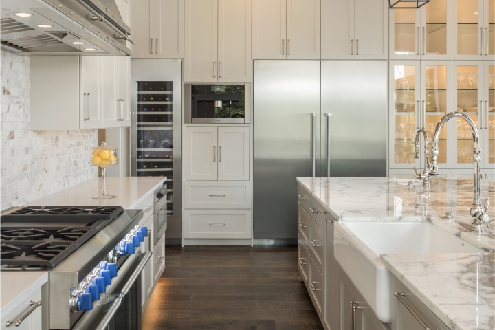
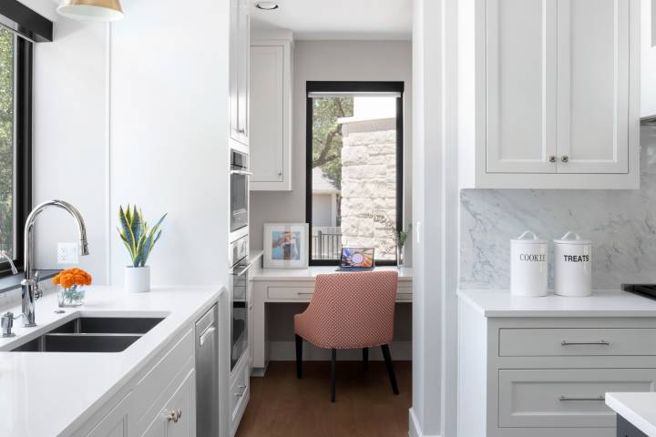
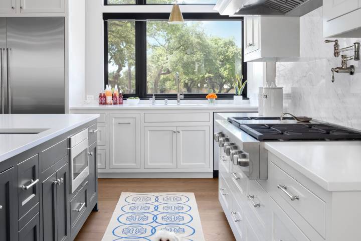
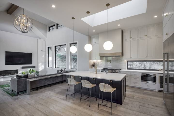
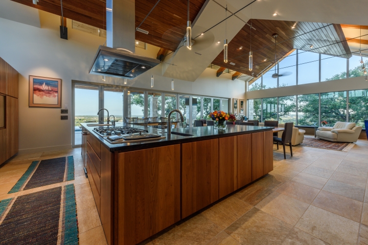
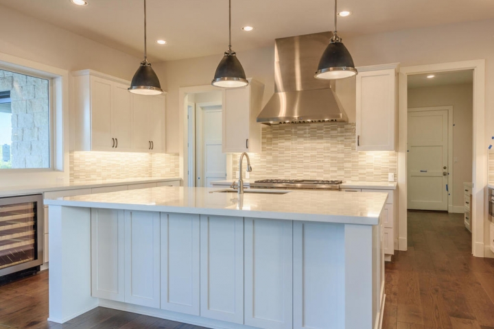
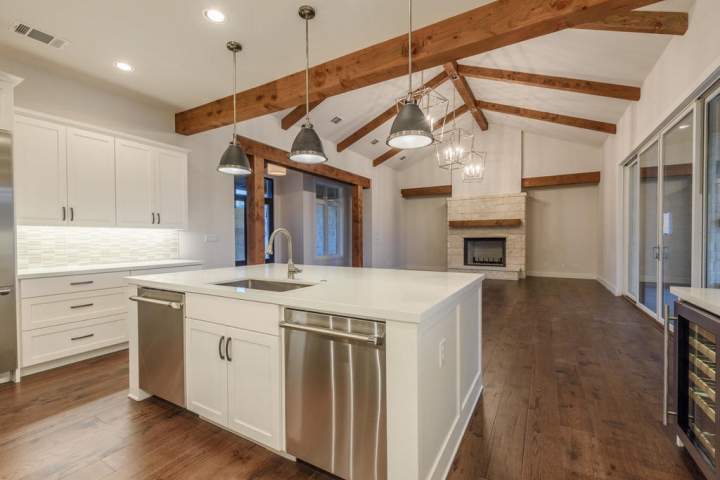
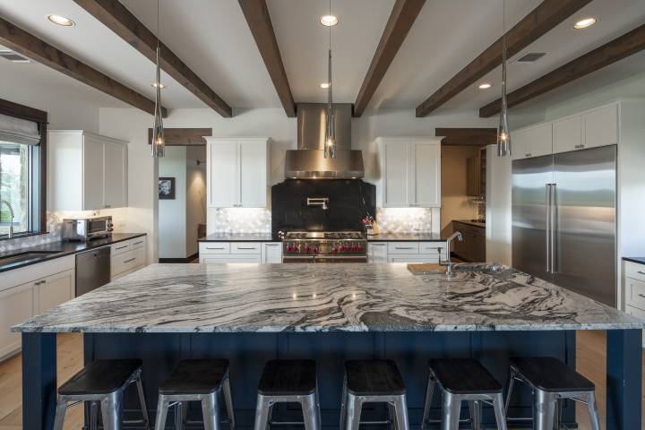
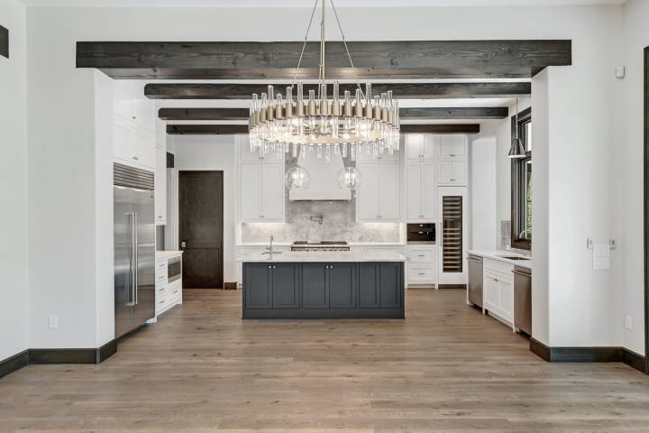
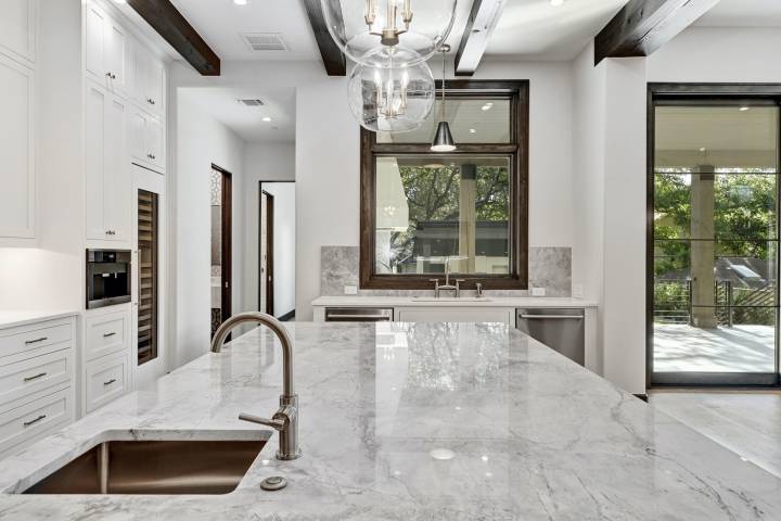
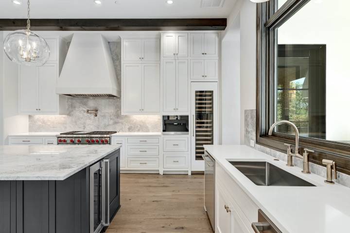
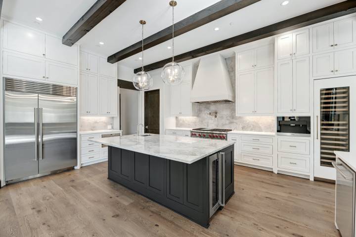
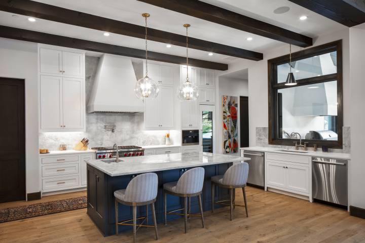
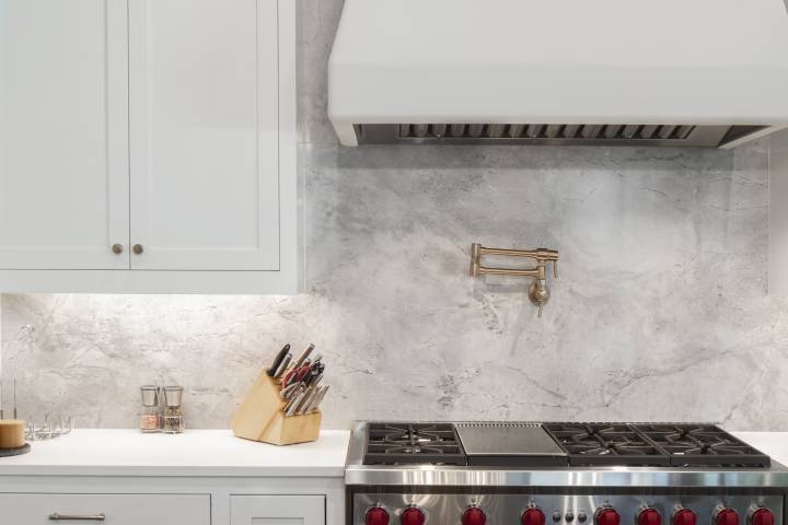
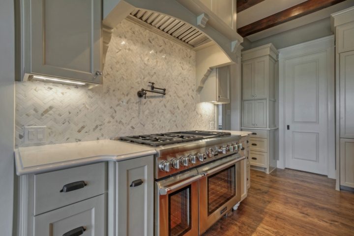
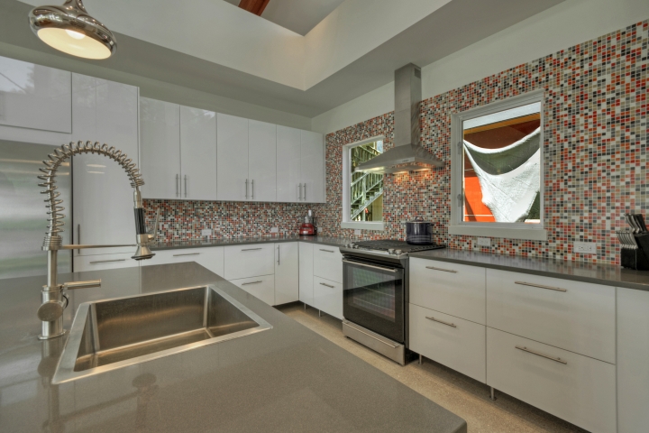
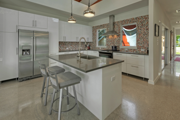
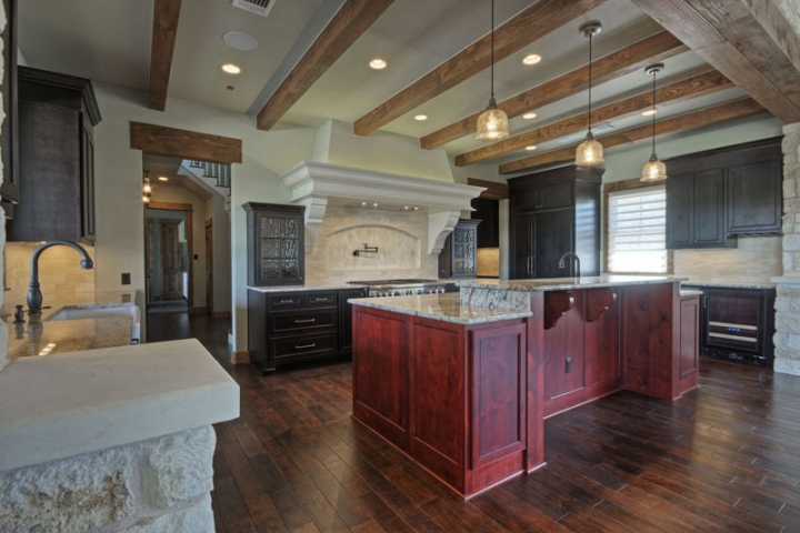
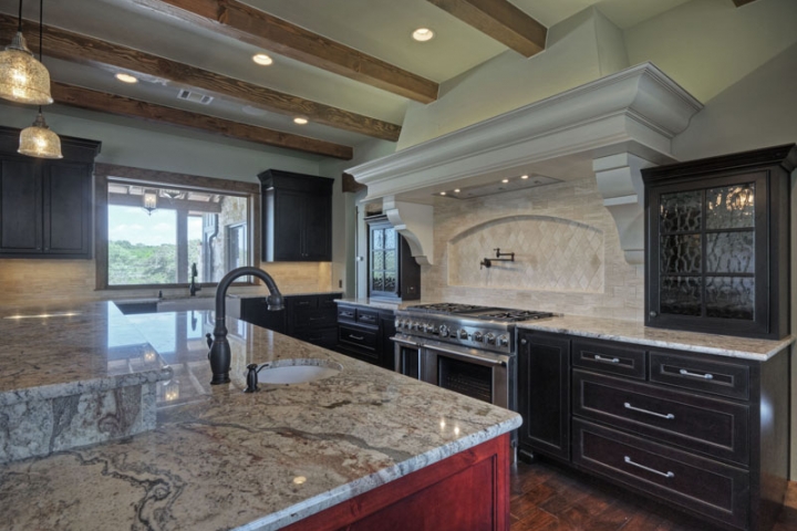
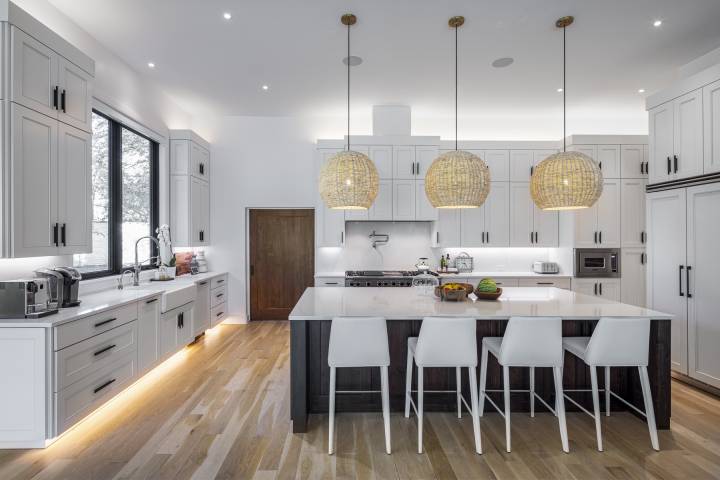
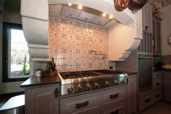
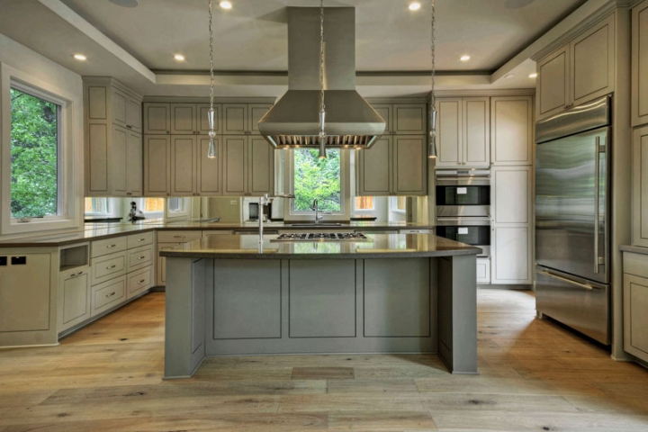
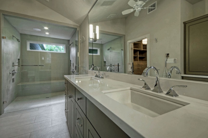
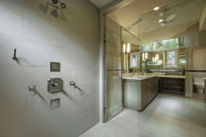
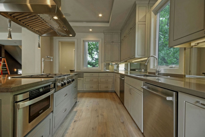
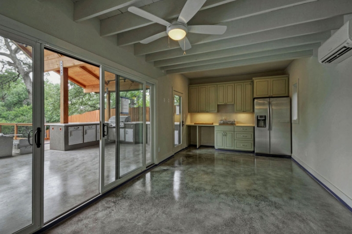
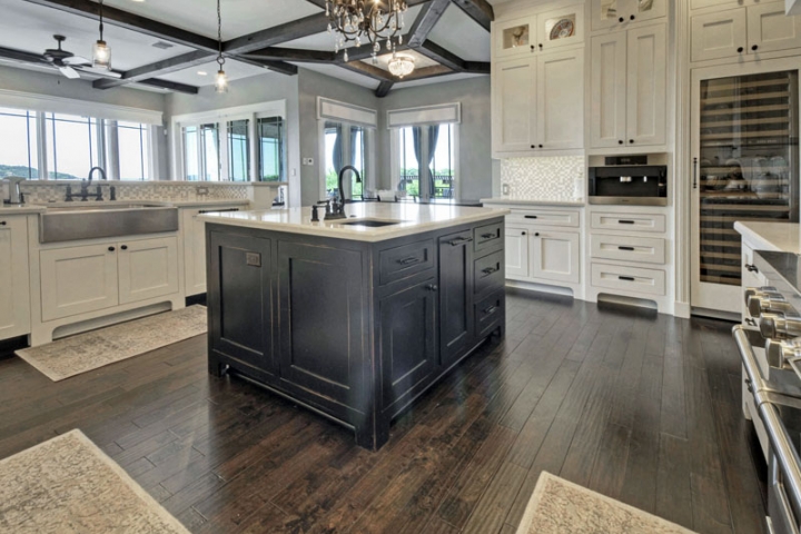
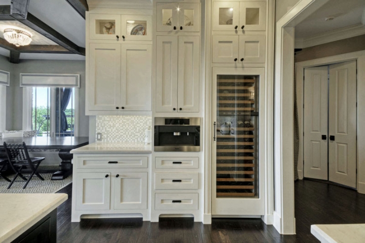
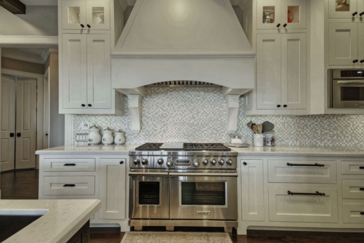
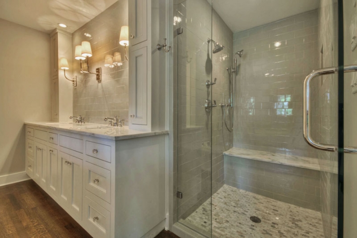
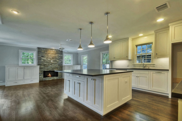
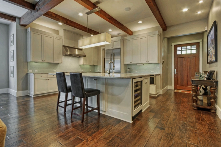
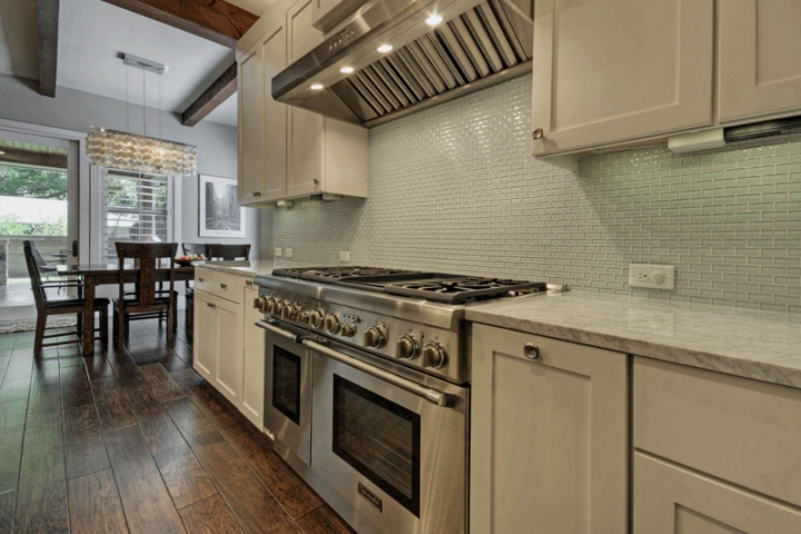
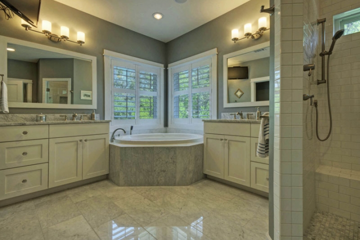
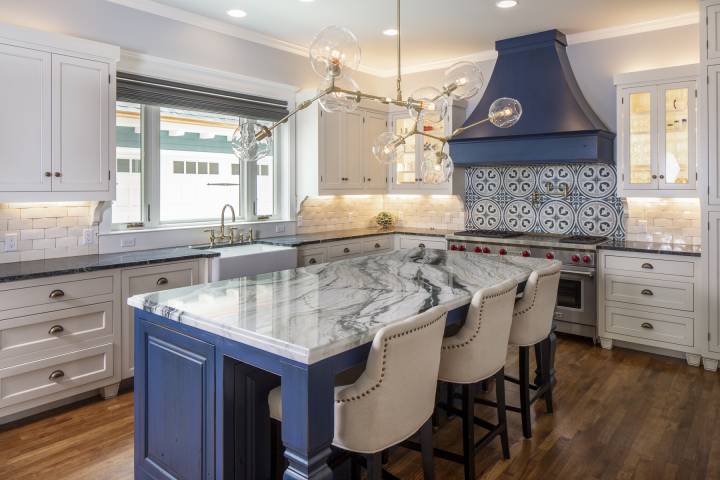
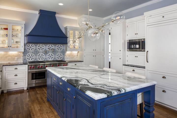
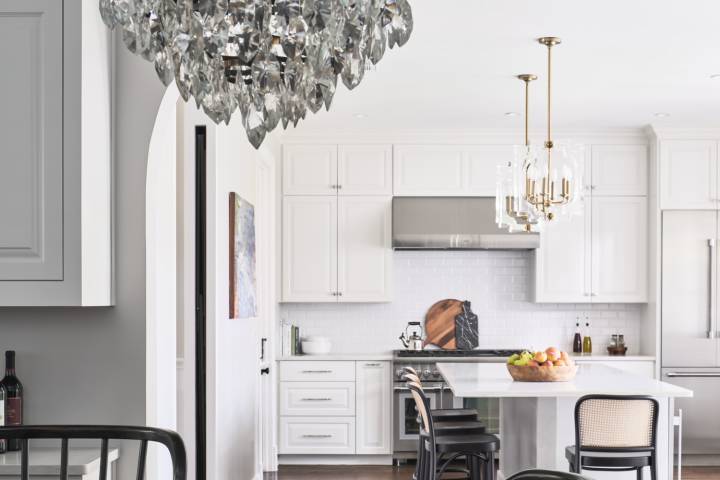
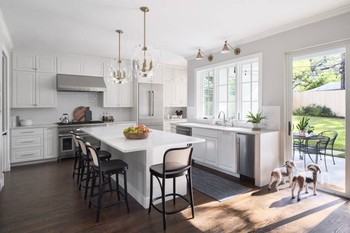
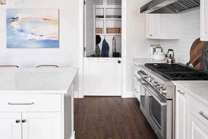
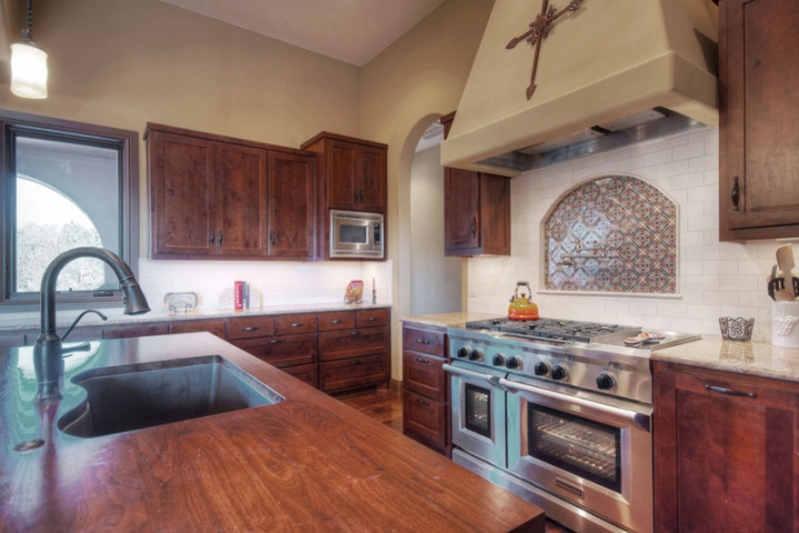
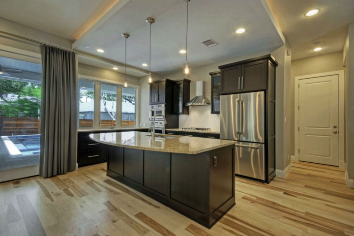
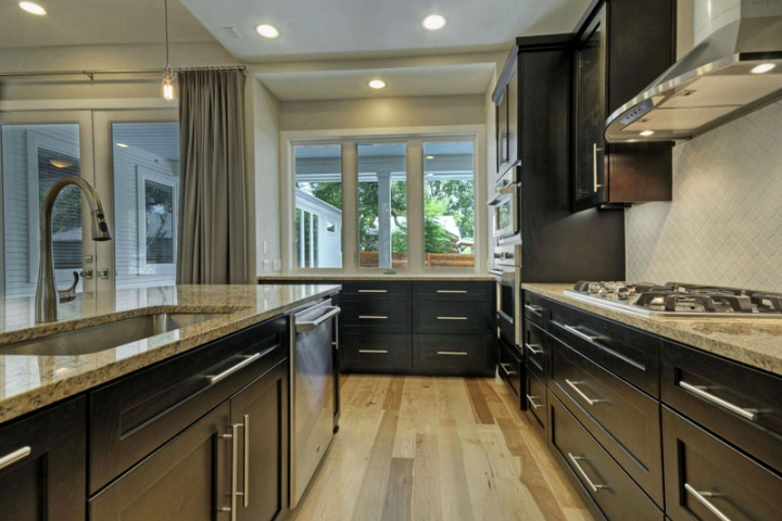
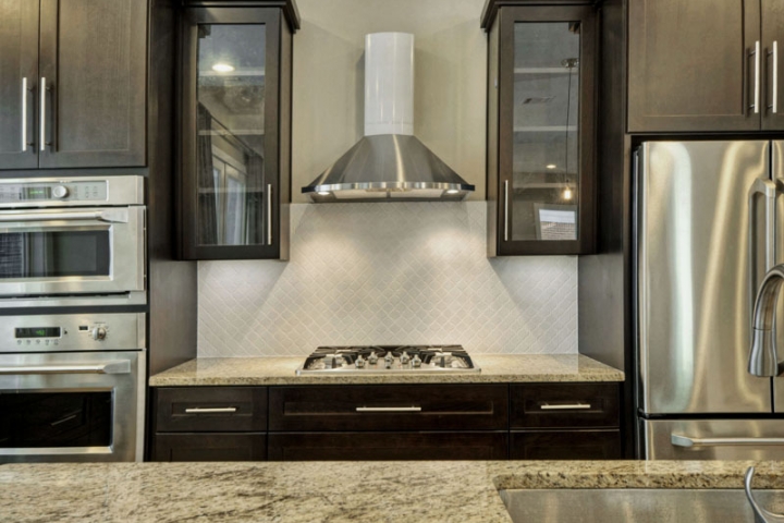
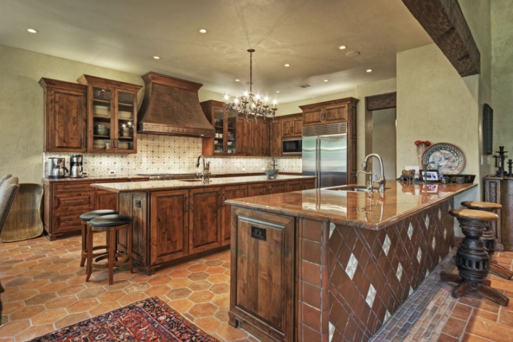
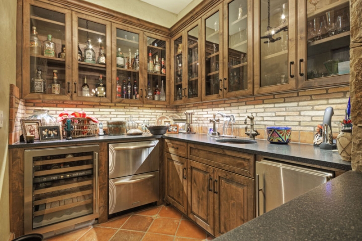
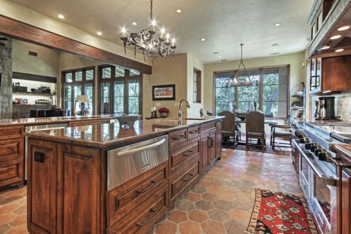
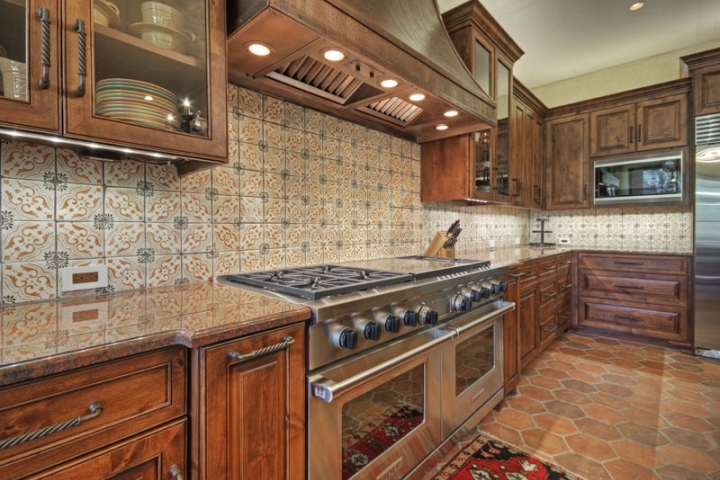
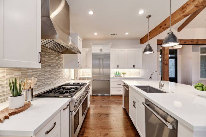
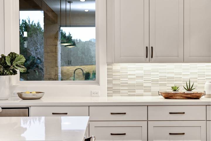
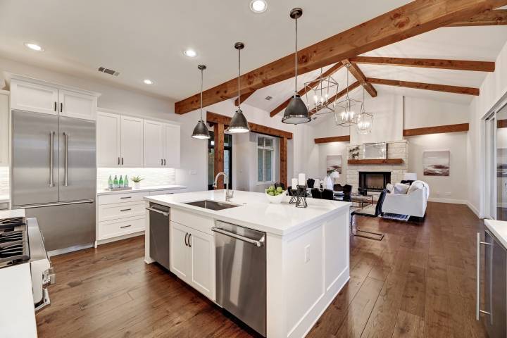
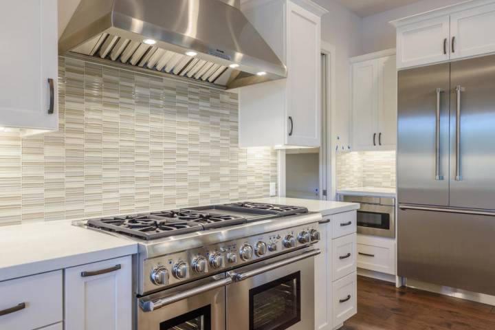
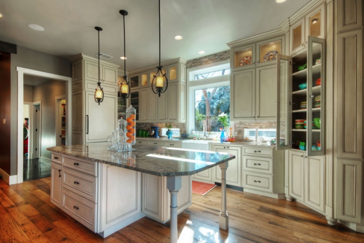
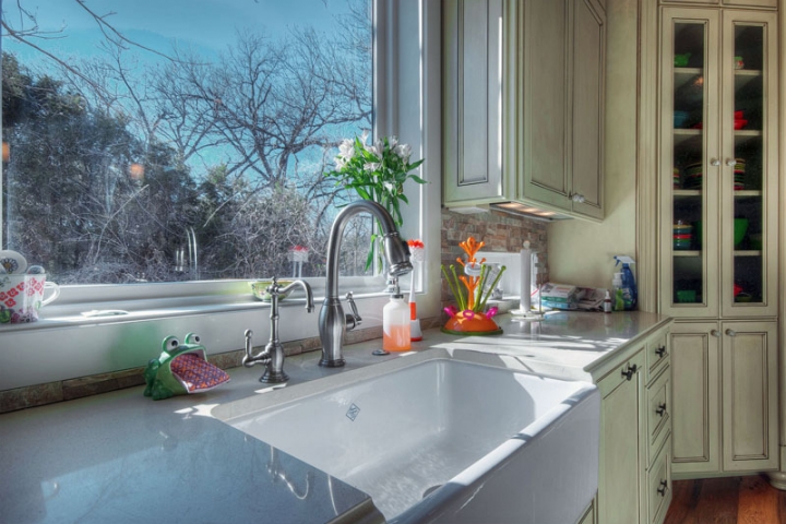
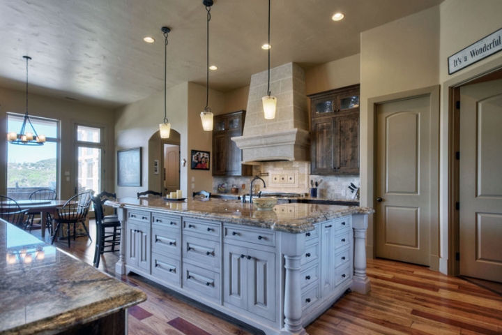
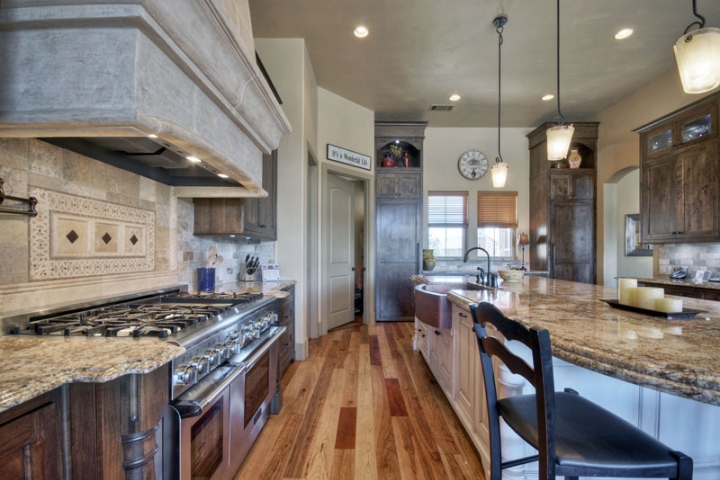
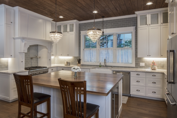
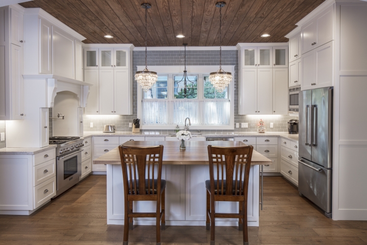
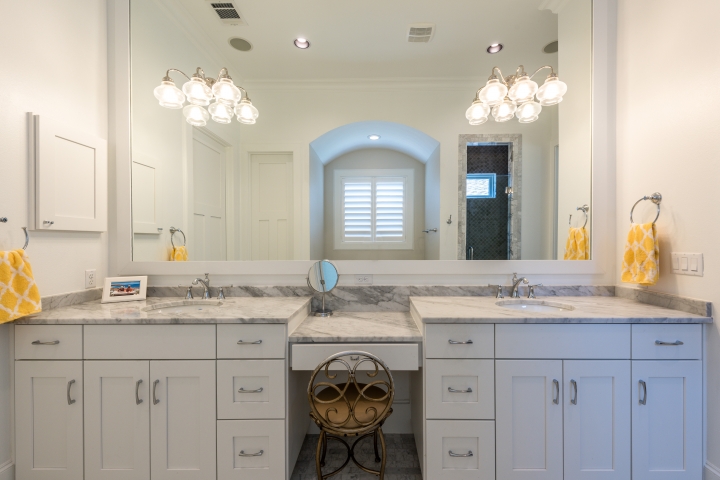
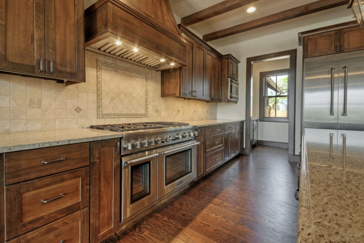
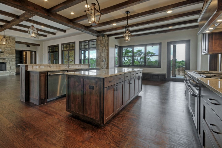
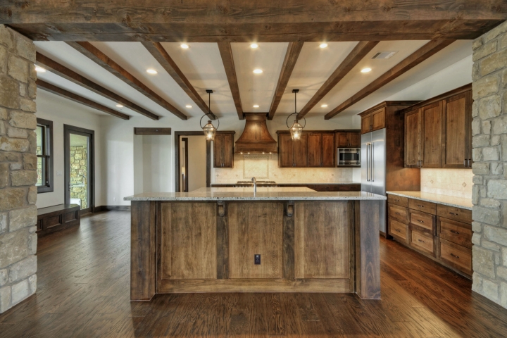
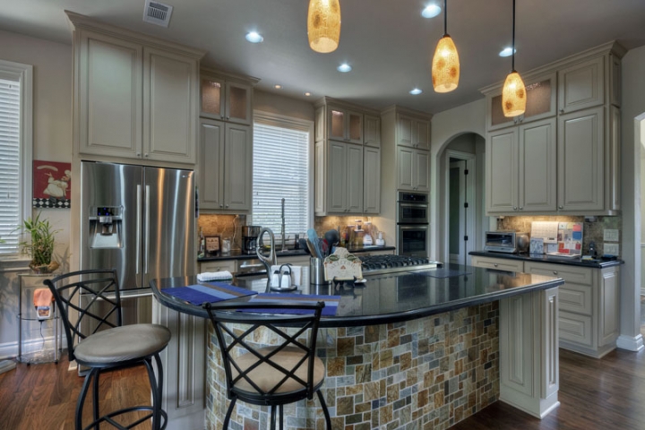
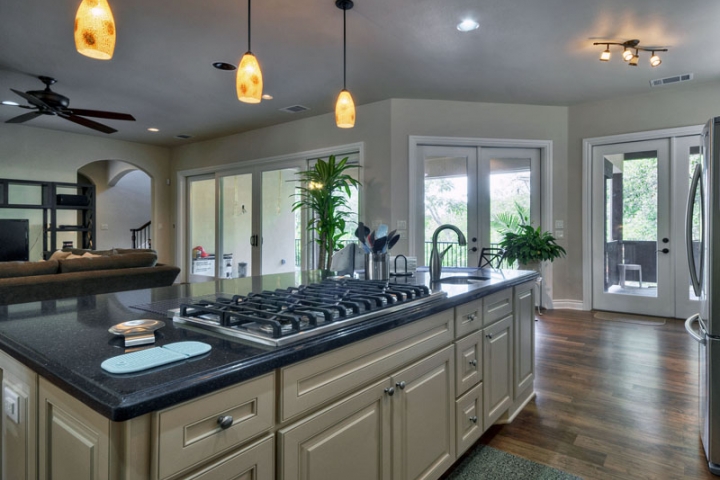
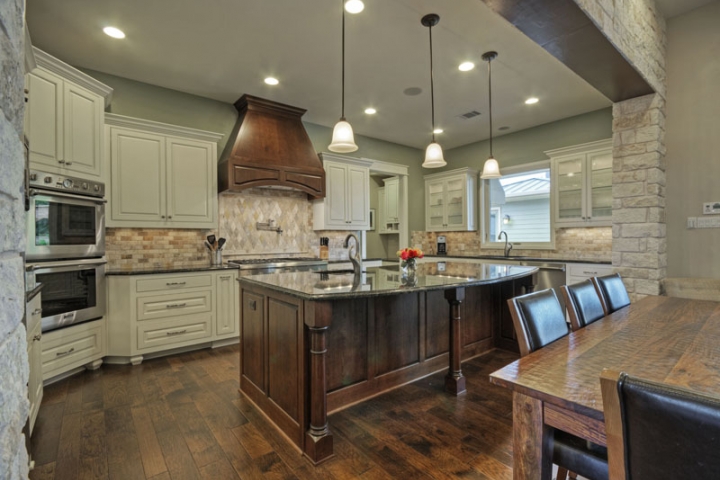
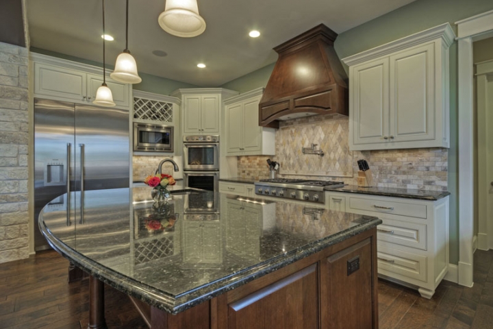
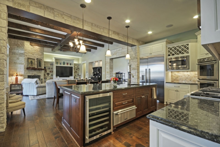
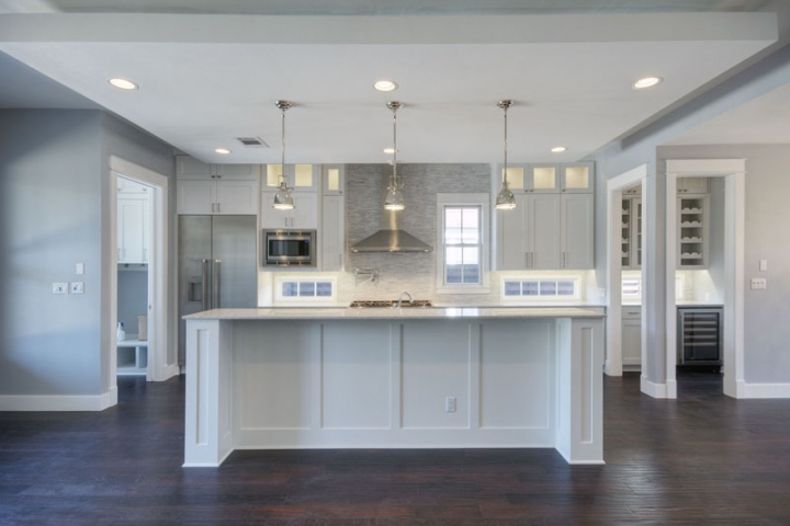
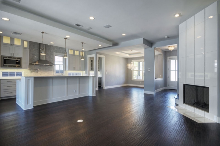
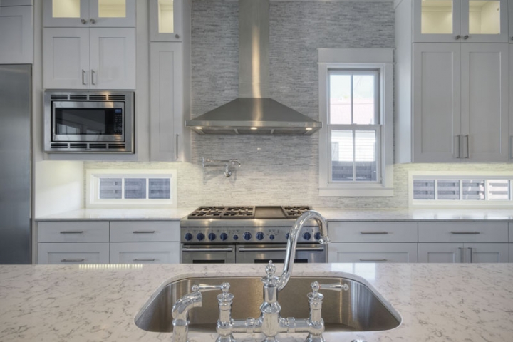
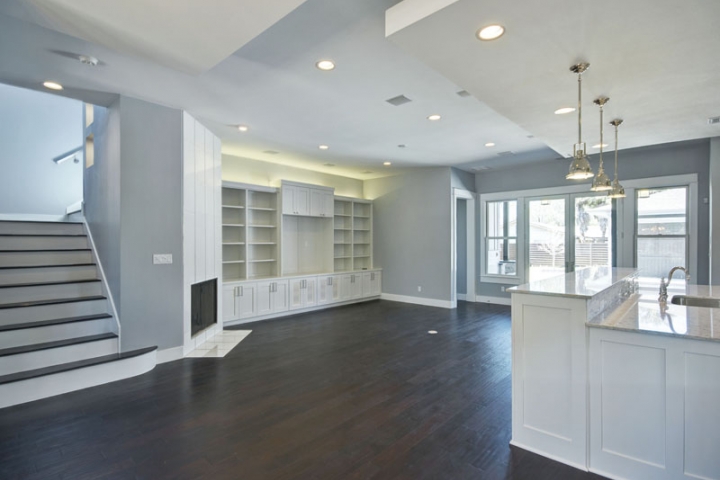
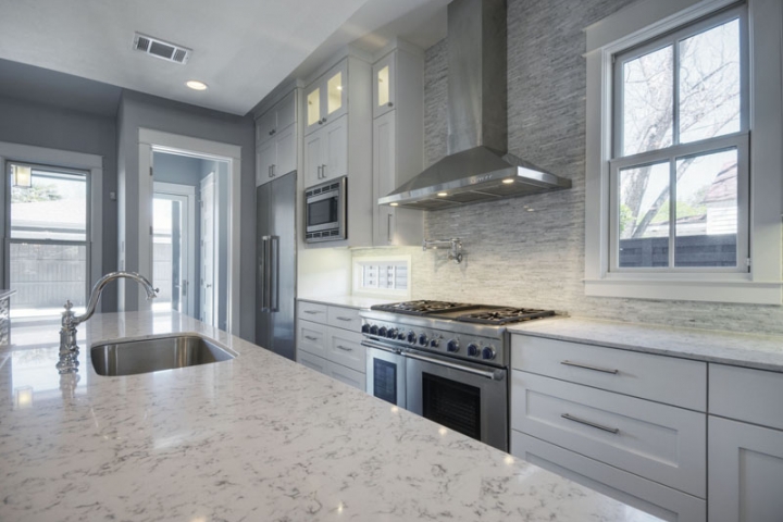
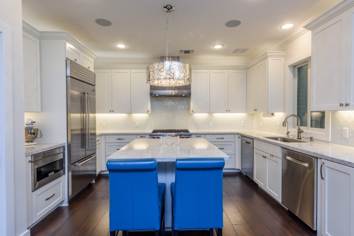
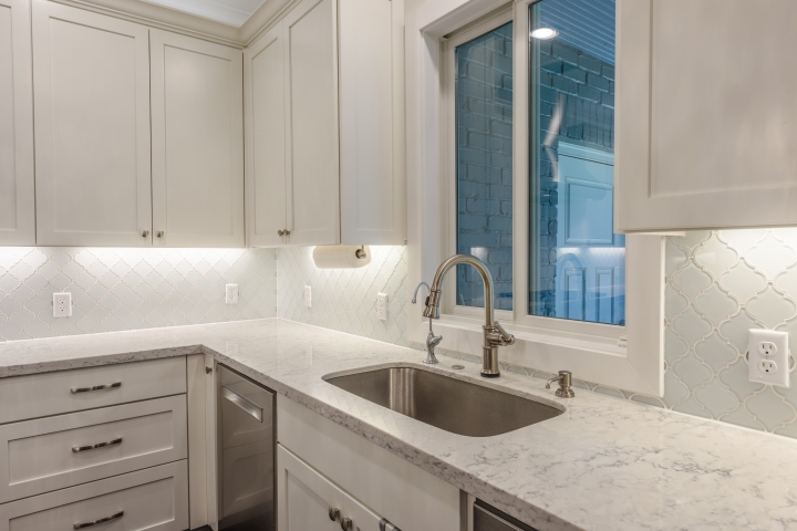
White is still the predominant color in the kitchen, according to Houzz’s 2020 survey of kitchen trends. Nearly half of all homeowners who completed a recent kitchen renovation or are planning to renovate choose white cabinetry. At the same time, homeowners are also interested in high-contrast pairings. Searches by Pinterest users for “white kitchen cabinets black countertops” increased by 1,276% from last year. Responding to interest in dark countertops, quartz composite company Caesarstone recently released three new black surfaces: Black Tempal and Empira Black resemble natural stone, while Oxidian mimics dark oxidized metal.

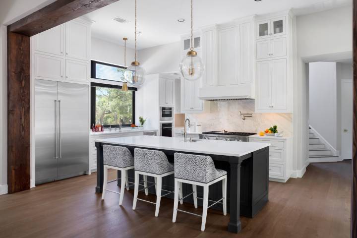
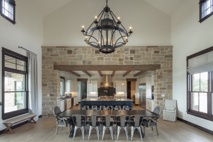
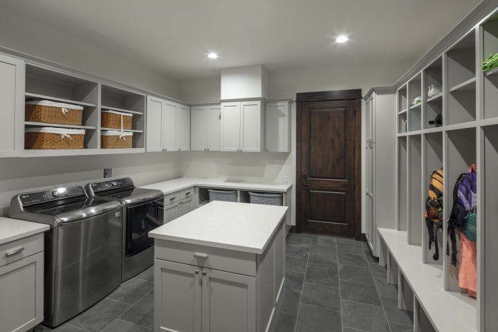
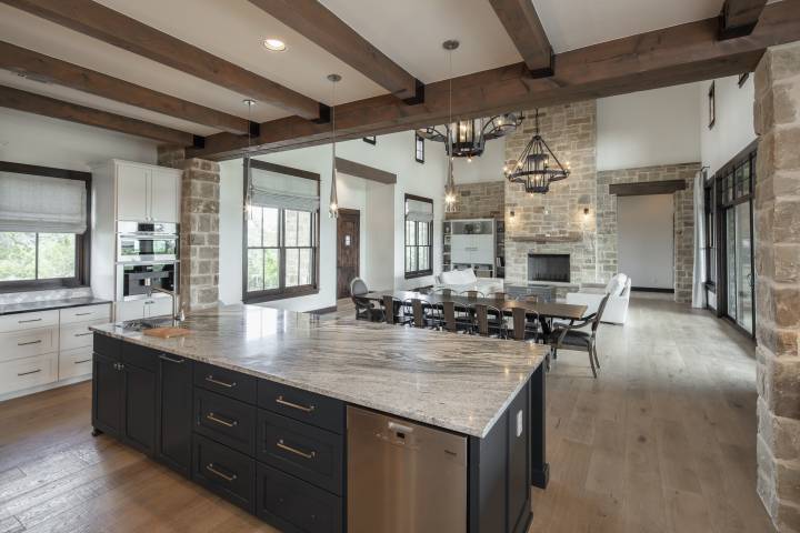
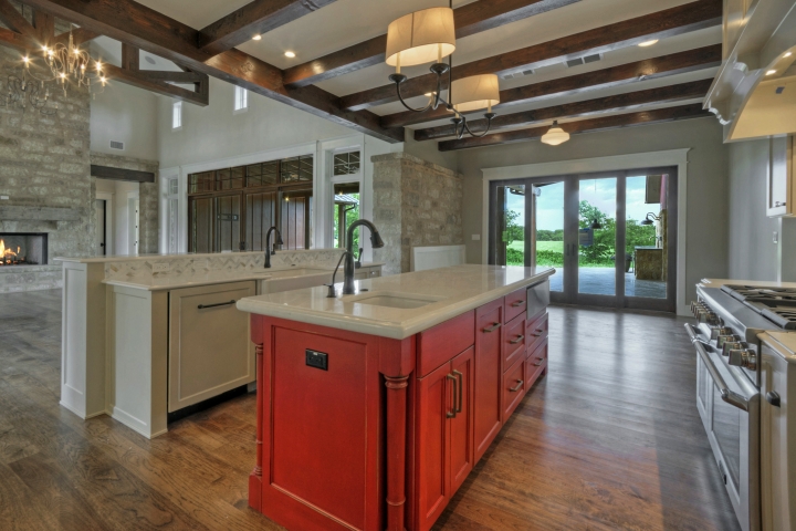
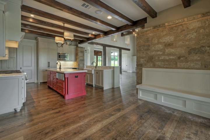
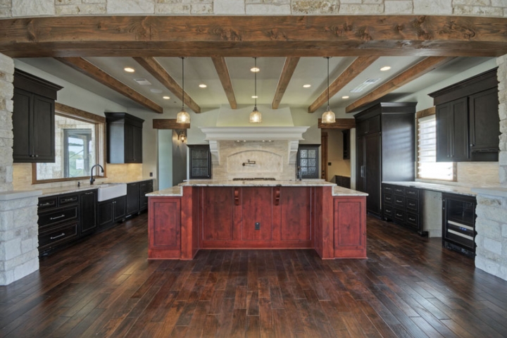
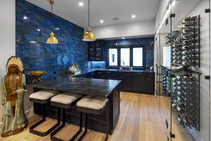
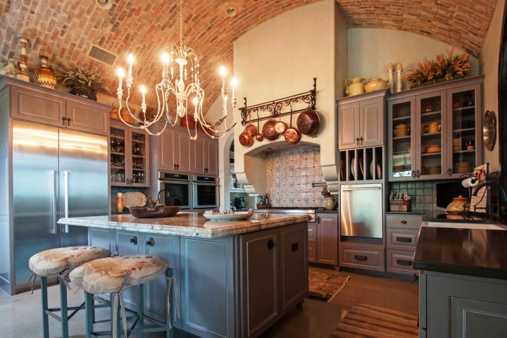
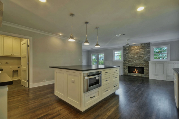
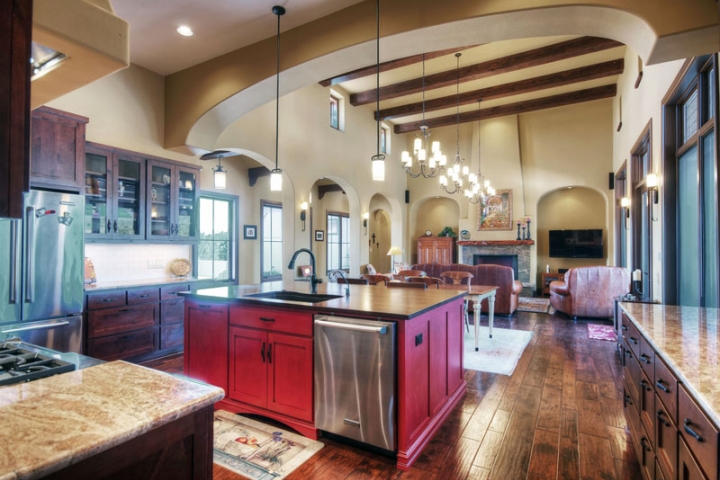
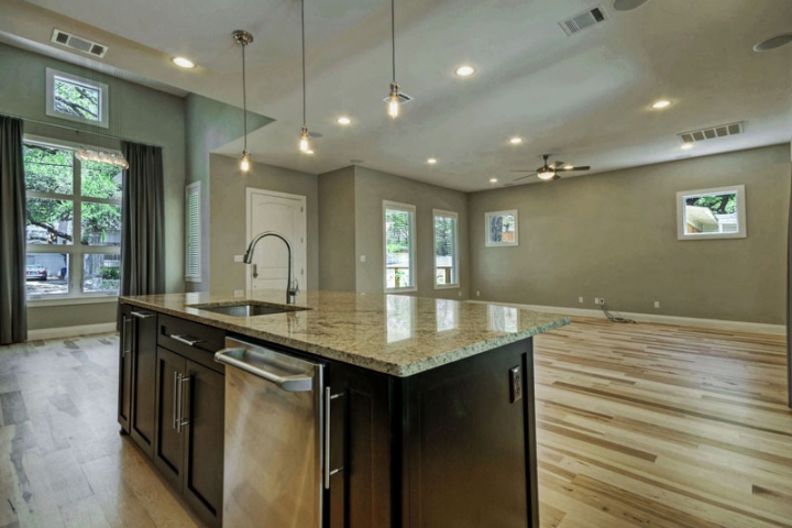
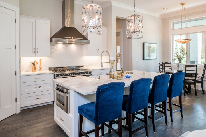
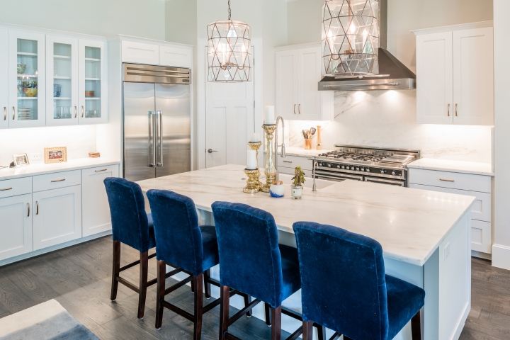
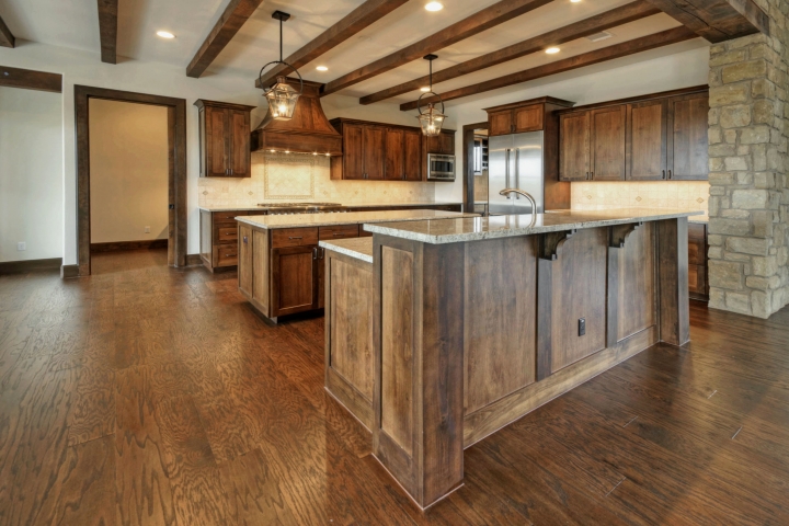
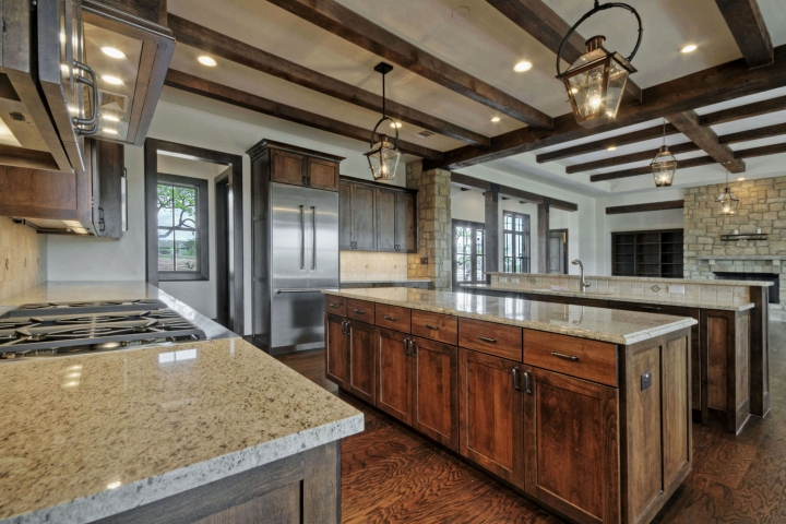
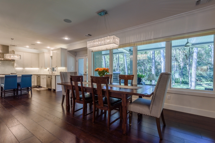
Over the past few years, the tuxedo kitchen, which typically combines dark lower cabinets and light upper cabinets or open shelving, has become increasingly popular. Painted in the same color as the walls, the upper cabinets recede into the background, while lower cabinets, done in a different color, stand out and look more like furniture. “You could do lower cabinets in a color like Sherwin-Williams’ Naval or Benjamin Moore’s Chelsea Gray, and white upper cabinets with a white subway-tile backsplash, and the kitchen will look so sharp,” says Marceny of Color Concierge. “It would really elevate the look of the house without taking much of a risk.” Note that in Zillow’s color analysis, homes with tuxedo kitchens saw a $1,547 bump up in sale price.
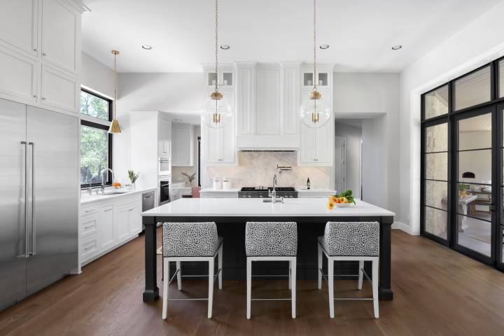
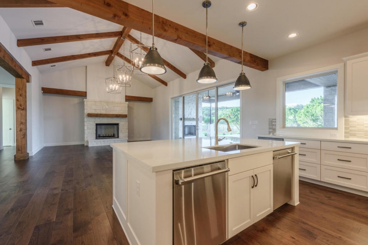
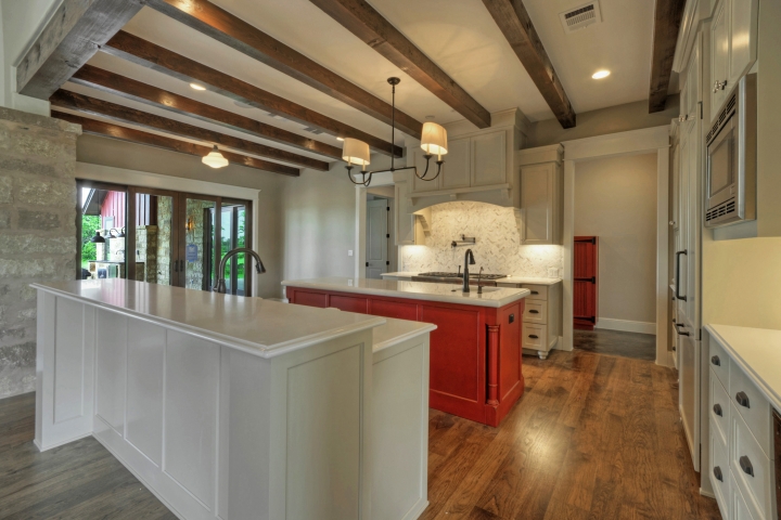
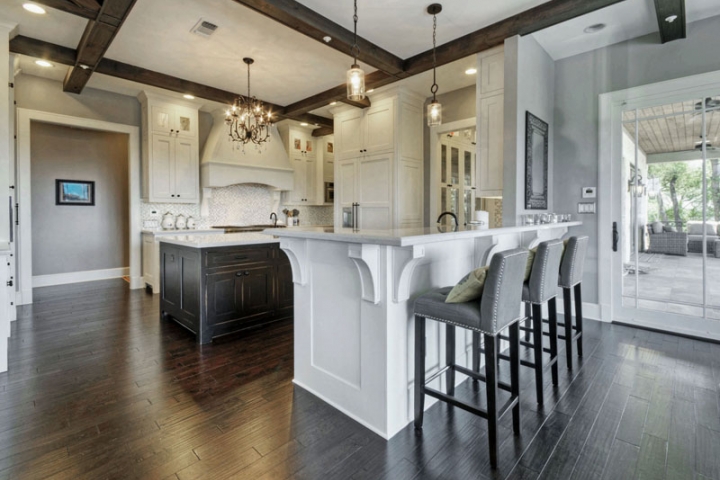
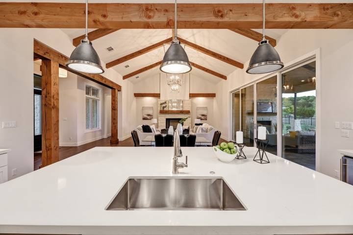
Likewise, for open-concept kitchens that are designed specifically for entertaining, it makes sense to distinguish kitchen islands from the rest of the cabinetry. According to the Houzz kitchen survey, 40% of new or remodeled kitchen islands are in a contrasting color (45% are gray or blue, while 11% are black).
Black and Beyond
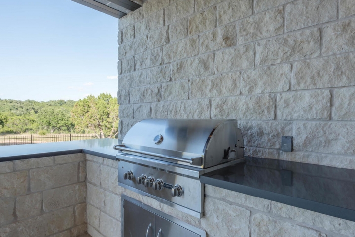
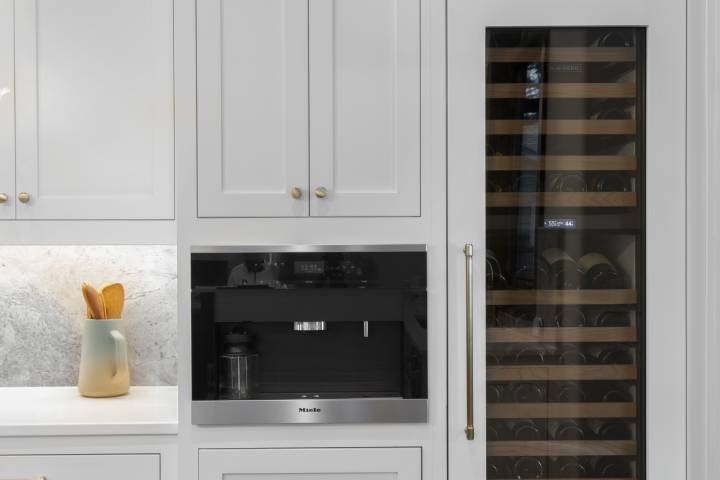
While a nearly all-black kitchen may be for design magazines only, black finishes on appliances and fixtures are definitely gaining traction. The Houzz kitchen survey reports that while 73% of households stuck with standard stainless appliances for their renovation, black stainless and other black finishes accounted for another 15%. “We see matte black and gunmetal gray finishes in the kitchen replacing traditional stainless steel, giving it a sleek look,” says KB Home’s Kirk.
In addition to its contemporary edge, black stainless is also practical; it’s touted for being much easier to keep clean and smudge-free compared with stainless. Black stainless is available from most major appliance manufacturers, and GE and LG also offer a matte black option. Maytag recently introduced a matte powder-coat finish called cast iron black, making the look accessible on a budget.

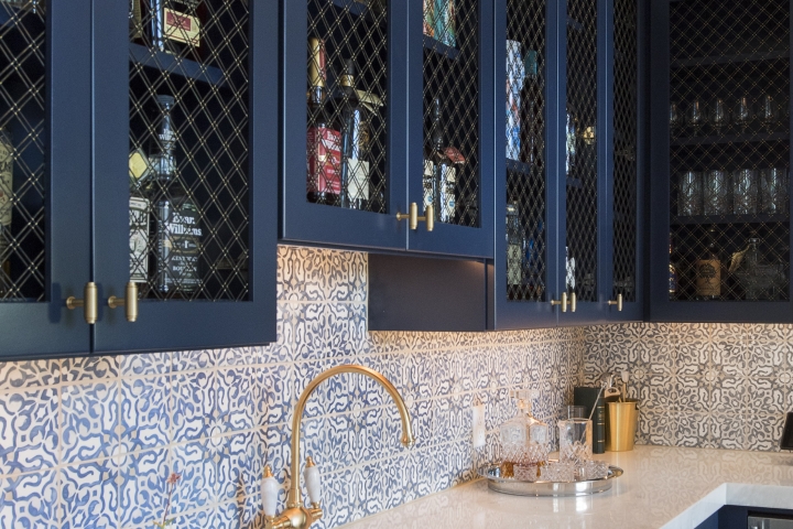
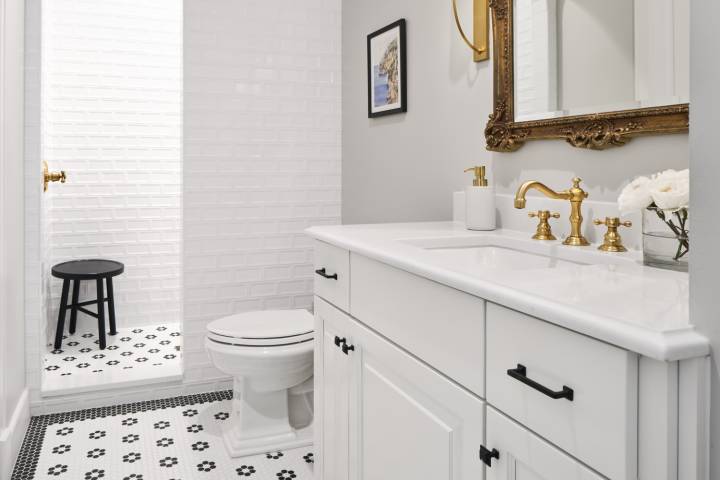
Metallic finishes also continue to be on-trend. “In addition to black finishes, we’re seeing a resurgence in brushed gold in everything from lighting to door hardware. Kitchens and bathrooms incorporating metallics have a very modern look,” notes Kirk at KB Home. Gold and black finishes come together in a number of high-end faucets with split finishes, which combine two finishes in one faucet. An early entrant was Brizo’s contemporary Vuelo faucet; new to the market is Rohl’s Graceline pull-down kitchen faucet in matte black, which has a gold handle and spout.
Offering a huge number of potential combinations for a split-finish faucet, Axor’s sleek My Edition faucet is available in 13 different finishes coupled with six different top plates, in materials that include marble, wood, glass, and even leather. Introduced a year ago, one of the most popular combinations has been the satin black finish with the black walnut top, according to the company.
Color Wash
To create a dramatic impact in a room, one tried-and-true approach is to focus on one major element and make it the star. For instance, a colorful appliance or fixture can be the pop of color in an otherwise monochromatic space. Several high-end kitchen appliance manufacturers offer colorful options. KitchenAid is also known for its cobalt-blue appliances. Dacorfeatures a color matching system that it recently revamped, which allows an appliance to match any color swatch.
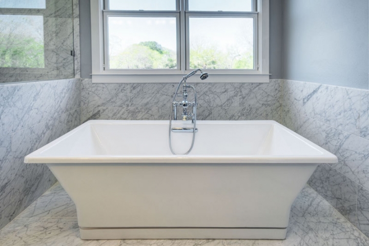
The sink or tub can also be the locus of color in a room. In addition to black, Kohler has placed a bet on dark blue and a daring dark purple. Last year, it introduced indigo blue and black plum as options for some of its cast-iron tubs and sinks. Its Cairn composite granite sink is available in eight colors, including black, dark gray, dark brown, and dark purple.
One of the more interesting products on the market today gives the homeowner the ability to switch the color and appearance of their kitchen sink. Elkay’s Crosstown stainless-steel farmhouse sink offers an easy-to-change apron front that includes standard stainless but also colors like red and gold. The most popular apron is traditional white ceramic, but the next is sapphire stainless, a dark blue.
“You can revitalize your kitchen without remodeling it by changing up the accents, for a relatively minimal amount of dollars and effort,” says Jimmy Slattery, senior product manager at Elkay. The company is currently looking into additional options in more colors, as well as an apron featuring natural wood. Kohler has since chimed in with its recently announced Tailor farmhouse sink, which has an apron that can be customized with user-supplied materials in addition to Kohler’s inserts.
As builders look for more ways to offer customization to their clients, products that allow homeowners a choice of colors and finishes—and the option to switch them out down the line—can help show a commitment to creating a personalized environment.